@firhanramSubmitted almost 4 years ago
any feedback would be great!

any feedback would be great!
From the start, the media query is toooooo big, reduce it to laptop size ( 1021 px ), here you can get more info about common media queries breakpoints
https://cutt.ly/Rlo5upC
second, instead of using "ntchild .class .class" stuff I see on your css, just make a new class bassed on the style you are making.
instead of having that stuff for "color: var(--very-dark-grayish-blue);" make a new class, maybe called "card__body--dark-blue"
for the grid you don't need to use more than 4 1fr or "repeat(4, 1fr)" you'll get a better result.
Hola, cualquier comentario constructivo es más que bienvenido.
Hello, any constructive comments are more than welcome.
Hola, viendo tu codigo puedo hacer unos pocos apuntes.
trata de mejorar el css, al body en lugar de usar height y width, usa max-width y min-height todo con vw/vh y al main ponle los 100% asi te aseguras que el main no sea mas ancho ni largo de lo necesario, en lugar de usar margin para darle espaciado al contenido usa padding ya que el margin te mueve el contenedor, el padding no y redúcele el valor de 80, es demasiado.
creo que seria todo, hay mas detalles, pero es información mas avanzada, pero si la quieres puedes buscar sobre el "SEO" que trata sobre el uso de las etiquetas html para que la pagina tenga un mejor posicionamiento en los buscadores como google
Hi Guys. I just completed my first advanced challenge. I used React for implementation. I'll appreciate any comments or feedback. Thank you!
Everything looks great, but in small details you need to add a "all" option in the filter, I can't recover all the countries when set a continent and also you could add some pagination like Infinite scroll that way all the countries doesn't load at the same time.
try to use another endpoit of the api to use the borders alpha code to solve the HTML errors
and last but not least axios is a good library you could use for fetching data from the api, you could set a baseurl and that way you don't need to sent the entire url, just the endpoit for example {{baseurl}}"/api/data"
Hello friends give me Any feedback is welcome.
Hi, I see you made the design but there are some things you could do to improve, having using a position relative/absolute on the body is not the ideal solution since the more elements you add more work you'll need to do on the positioning, I suggest to you to learn about CSS flexbox and CSS grid that could improve a lot your CSS and reduce the lines of code you use.
I see you have "font-family: 400", font-family stays for the name of the font, like Arial, sans-serif and so, font-weight only accepts 1 value you can't use 400, 700.
using a table for the footer is not a bad idea, but not the ideal, you could encapsulate the 3 elements each one on their div container, and use a display flex yo put then on the center.
I hope this could help you to improve and remember to check the report to get more info about you could fix
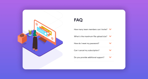
This took me much longer than I thought purely because of the image. I struggled to position it correctly and still do not have the correct position for the mobile screen size, so any feedback in how this could be done better would be very much appreciated!
Hi, first of all, you don't need to set the body's height to 100vh, that could ruin the design in the long run but if you want to have 100vh you can use min-height, the body still has all the viewport height but if the content exceeds, you'll get a scroll, that's why your mobile version looks weird.
On the mobile version, the image overlaps the FAQ title, instead of using a position: absolute;
since all the image fit inside the container, you could use a flex-box to fit all the content without overlapping
Any feedback guys?
Everything is ok, just a tinny bit about the ul not having a li, change them to a div and centering content, I notice you used a display flex, you can avoid margin: 0 auto;
putting on the body
aling-items: center;