Naweli Verma• 10
@naweli777
Submitted
@LaurenC2022
@naweli777
Submitted
@LaurenC2022
Posted
I made some changes in your code below. I changed the a div to a section and an h4 heading to an h1. I think this makes it more semantic. You might need to go back and play around with the font sizes and font weight, but I think these changes make it better for screen readers and for accessibility
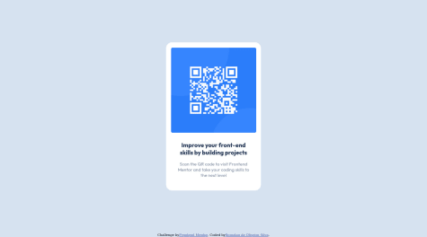
</head> <body style="background: powderblue;display: flex; align-items: center;justify-content: center;width: 400px; margin: auto;margin-top: 10%;"> <section style="background: white; padding: 20px; border-radius: 15px;"> <div> <img src="../images/image-qr-code.png" width="400px" alt="qr-code"/> </div> <div style="display: flex; align-items: center;justify-content: center;text-align: center;flex-direction: column;"> <h1 style="font-family: Arial, Helvetica, sans-serif; font-size: 2rem;margin-bottom: 0;">Improve your front-end skills by building projects</h1> <p style="color: rgb(151, 151, 151);font-family: Arial, Helvetica, sans-serif; font-size: 1.5rem;">Scan the QR code to visit Frontend Mentor and take your coding skills to the next level</p> </div> </section> </body> </html>Marked as helpful
@Jhowpix
Submitted
@LaurenC2022
Posted
Use semantic HTML instead of <div> for most elements. Also, the first <p> I think is best as a <h1>. I noticed other people's feedback have similar comments: not semantic enough.
Your code is well-structured and very readable. The layout does look good on a range of screen sizes. I will be referring to your code and updating my mine. It looks nice.