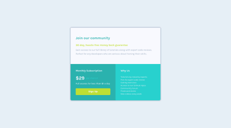
For some reason mobile design is not loading. If you want to help me with some tips to resolve this problem or any other issues please visit my github page and take a look at css file. Thanks! [Challenge was rebuild and replaced for a better solution =) ]
Karthi Krishnamurthi
@Karthi13krishnaAll comments
- @claudio-dev1993Submitted almost 2 years ago@Karthi13krishnaPosted almost 2 years ago
Hey! You have done a fantastic job. I have learned a few things from your code .😃 If I have to suggest a few things, I would tell you to go mobile first because these card sections will be stacked below one another by default. So you'll end up writing fewer lines of code. Also, I would design the card using a flexbox like this. But I believe nothing's wrong with your approach. I am pretty new to web dev so I don't know much about best practices. And I don't see any problems with your mobile design. It looks just fine to me.
Happy coding!
Marked as helpful1 - @Rjae07Submitted about 2 years ago
How can I get my margin right?, sometimes I get stock to margins and paddings, like with the https://rjae07.github.io/Qr-code-component/, I push the image more to right, I cannot get the image center like the example.
@Karthi13krishnaPosted about 2 years agoYou have done a good job! I think you can make a few changes to improve your website.
- I have observed that you are trying to center the card component using padding. I would recommend using Flexbox, Absolute Positioning, or Transform and Translate. You can refer this link.
- Use heading elements for headings.
- Use padding to add space around an element's content, and use margin between different elements to separate them.
PS: I'm new to HTML and CSS, and there might be a better approach. I hope this helps.
Marked as helpful0

