Jun41dU
@Jun41dUAll solutions
- Submitted about 2 months ago
Fundamentals of HTML and CSS - QR reader
- HTML
- CSS
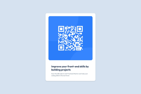
When looking at my code, I feel my approach to 'responsiveness' meant that the design isn't perfect, such as the word 'skills' in the main body text not being on the second line like with the example picture. Some pointers also on how to fix this would be great.
