@lacinak10Submitted over 1 year ago
Latest solutions
Latest comments
- @JonnyCash-1510Posted over 1 year ago
Looking good! Maybe make the card a bit larger and don't forget, to change the font... And there are some tiny spelling mistakes, that you should probably fix.
1 - @Ariyibi-BaseetSubmitted over 1 year ago@JonnyCash-1510Posted over 1 year ago
Looking good! Maybe only show, that the email is invalid and that the button is diabled, when the user initially tries to enter a string, thats not an email... but everything else looks good (I like the new BG-Color)
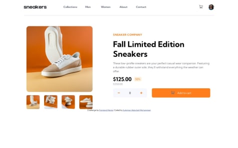
0 - @Abduljalil11Submitted over 1 year ago@JonnyCash-1510Posted over 1 year ago
Looks good! Maybe make the Cart-Window disappear, when the user clicks next to it on the main window... everything else is nice!
1 - @zetmosoma10Submitted over 1 year ago@JonnyCash-1510Posted over 1 year ago
I think your design looks even better than the solution :) keep it up!
1