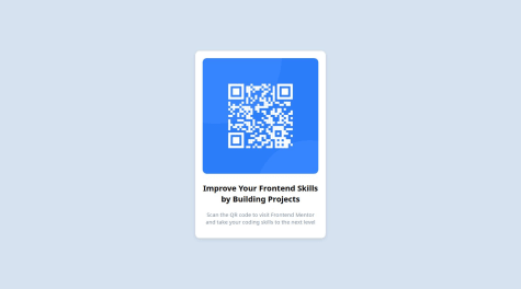
What I'm most proud of: I'm most proud of the clean and elegant design I achieved for the QR code component. The layout is visually appealing, and the use of contrasting colors helps draw attention to the QR code and the accompanying text. Additionally, I'm proud of how I integrated the Frontend Mentor attribution seamlessly into the design without it being obtrusive.
What I would do differently next time: Next time, I would focus more on ensuring full responsiveness across various devices and screen sizes. While the current design is somewhat responsive, there is room for improvement to ensure a consistent and optimal user experience on all devices. Additionally, I would explore ways to enhance the accessibility of the QR code component, perhaps by providing more descriptive alt text or implementing other accessibility features to make it more usable for all users.
Where I need support: I would appreciate feedback on how to improve the accessibility of the QR code component further. Additionally, any tips or best practices for achieving full responsiveness across different devices would be helpful. Finally, suggestions for optimizing the performance of the webpage, such as minimizing load times or reducing unnecessary resources, would also be valuable.
What challenges did you encounter, and how did you overcome them?Challenges Encountered: One challenge I encountered was ensuring the QR code component displayed correctly across different screen sizes and devices. Achieving responsiveness while maintaining the integrity of the design was crucial but presented some difficulties, especially in handling smaller screens without sacrificing readability or aesthetics. Additionally, ensuring the accessibility of the QR code component posed a challenge, as I wanted to make it usable for all users, including those who rely on screen readers.
How I Overcame Them: To address the challenge of responsiveness, I utilized CSS media queries to adjust the layout and styling based on screen size. By testing the design on various devices and using browser developer tools, I iteratively refined the styles to ensure a consistent and user-friendly experience across different screen sizes.
For accessibility, I researched best practices and standards for creating accessible web content, particularly regarding images and interactive elements like QR codes. I ensured that the QR code had descriptive alt text to provide context for users who rely on screen readers. Additionally, I tested the webpage using accessibility tools and made necessary adjustments to improve usability for all users.
Overall, by leveraging CSS techniques for responsiveness and adhering to accessibility guidelines, I was able to overcome these challenges and create a QR code component that is both visually appealing and accessible to a wide range of users.
What specific areas of your project would you like help with?Specific areas of the project where I would like help include:
Optimizing Accessibility: I'm looking for suggestions on how to further improve the accessibility of the QR code component, beyond providing descriptive alt text. Any additional techniques or considerations to enhance accessibility would be appreciated.

Enhancing Responsiveness: While the project is somewhat responsive, I'm seeking advice on how to ensure full responsiveness across a wider range of devices and screen sizes. Tips on handling smaller screens more effectively without compromising the design or usability would be helpful.

Performance Optimization: I would like assistance in optimizing the performance of the webpage, such as minimizing load times and reducing unnecessary resources. Any strategies or tools to improve performance without sacrificing functionality or design quality would be valuable.

General Feedback: Any additional feedback or suggestions for improving the overall design, user experience, or code structure would be welcomed.
Thank you in advance for any guidance or assistance provided!