
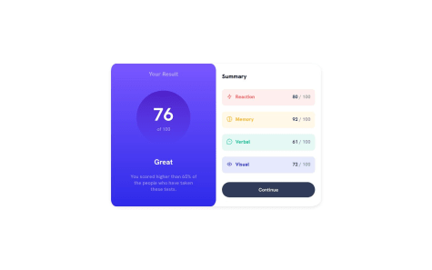
I found difficult using media queries in order to make the mobile design, since when applying it, it would cut my .left-container in half. To correct this, I changed height: 100vh; in body to min-height: 100vh; To be honest, I'm not completely sure of why that change helped my .left-container to be fully shown with my mobile view, however, I did notice it did not exactly show it as it appears on the mobile-design.jpg image in the design folder, since mine, shows white corners right on top. I wonder if the organization of my CSS is right, I tried to organize it the best I could, but I do feel I used too many DIVS and I wonder if I could have simplified that or if I should have used something else than flex box to organize my CSS. Other than that, I think my second project went fairly easy, I hope to continue learning and looking for ways in which I will be able to improve.

ANSHUL LAMBA
@Hawk3037All comments
- @alb91Submitted over 1 year ago@Hawk3037Posted over 1 year ago
I have checked your previous problem too so I want you to try using a display block or inline block in your media queries. and then give them a specific width or height you need so sometimes using other display properties is also convenient for more check my solution. hope it will help if not then tell me.
0 - @valeryehgSubmitted over 1 year ago
The areas of my code I'm most concerned about is the CSS; positioning and centering elements was the hardest part for me to figure out. I'd like to know if there is a better practice or more efficient way of positioning elements than the one I used.
@Hawk3037Posted over 1 year agoyou have added a div .card-box and used it for giving the background color white to the qr section but instead of this there is a simple method just start this div before the image and close after the paragraph and then give it a background color and padding it will work the same. so no need to add extra coding for this then
I will suggest using display: flex it will lot easier to use.
Marked as helpful1