Estanislao Elias Varela Lucius
@EstanisEVLAll solutions
- Submitted almost 2 years ago
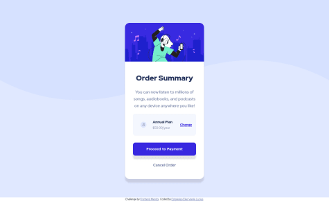
Responsive intro component with signup form | REACT JS, HTML, CSS & JS
- HTML
- CSS
- JS
- Submitted about 2 years ago
Responsive interactive rating component | HTML, CSS & JavaScript
- HTML
- CSS
- JS
- Submitted over 2 years ago
Responsive nft preview card component - HTML, CSS, Flexbox, SASS, GIT
- HTML
- CSS
- Submitted over 2 years ago
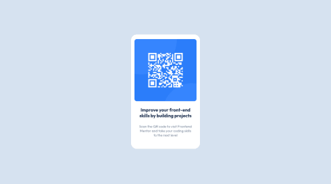
Qr code component solution - HTML5, CSS3, FLEXBOX, SASS, NODE.JS, GIT
- HTML
- CSS