@SalarSadeghiSubmitted about 1 year ago
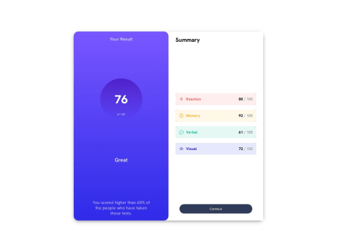
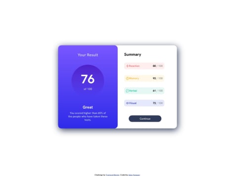
Which part of this project do you think is more important? In my opinion the corner-borders of the 4 items in the summary section(right-side). What is the best-practice implementing them? Check my solution...!

Which part of this project do you think is more important? In my opinion the corner-borders of the 4 items in the summary section(right-side). What is the best-practice implementing them? Check my solution...!
This is a great design, you are correct small borders at the edges are tricky. And you have nailed it properly.
We can make a few improvements here & there, like instead of repeating ids for each summary type, you can use class to apply style specific to each edge.
Also, for border style for each edge, we can set all borders in the common class, then in respective class hide unnecessary borders.
Your design looks awesome, great work.
The only thing is to avoid using fixed height & width. This causes a weird effect on element sizes on different viewport. Set some max & min width to allow elements to grow & shrink between them.