DIICA99
@DIICA99All comments
- @DxnielXndrewSubmitted over 3 years ago@DIICA99Posted over 3 years ago
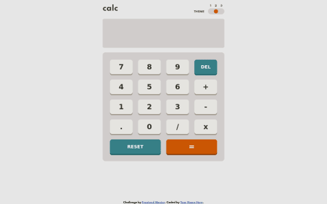
Nice job. But, but there's no space between the last element and the bottom of the page. I think u should have add it... Good job tough
0 - @dwi312Submitted over 3 years ago@DIICA99Posted over 3 years ago
😱😱😱 the theme switcher 😍 🔥🔥🔥. Nice job, really good looking.
0 - @devtezzaSubmitted over 3 years ago
- @DeboraBrumSubmitted over 3 years ago@DIICA99Posted over 3 years ago
Another thing Debora, you should definitely add comments into your code 🤦🏻♂️
Marked as helpful0 - @DeboraBrumSubmitted over 3 years ago@DIICA99Posted over 3 years ago
I love the theme switcher 😍.
First, I've noticed that when you try do any operation, the previous number disappears. When it should remain there and just add the operator to the number, and add the next number to do the operation.
Second, after an operation, the result remains there if you try to enter a new number, it adds the new number to the result. The result should be cleared, so that the calculator can do a new operation.
This is my humble opinion...
Marked as helpful0 - @bimasuci18Submitted over 3 years ago@DIICA99Posted over 3 years ago
Nice job. But in my humble opinion, you should fix the accessibility issues. It's very important.
Marked as helpful0 - @Sebastian-SanchezzSubmitted over 3 years ago
- @FloPereira75Submitted over 3 years ago


