Submitted
I build the social proof section taking the mobile first approach and mainly using Flexbox for the layout. The two parts, hero and cards, became flex containers on the desktop version while on the mobile version all the components fall in a column.
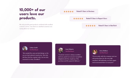
The star ratings layout was made with self-align applied to all three flex items. While the five starts are the svg background image applied to a div with background-repeat on space and a fixed width and height.
The cards have transform on translateY() for the scale effect.
This project helped me understand and play around with background properties and values and also got to implement translateY for the into an actual project and in a useful way.
I'm open to suggestions and corrections since I'm here to learn as much as possible.
Thank you for checking out my solution!