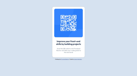
Im most proud of how the image and the text anded up aligned, I also liked how the padding ended up looking.
I woull try to find another way to center the content vertically, I used margin and flexbox but it didn´t look perfect.
What challenges did you encounter, and how did you overcome them?Centering the content was hard, i tried to use a flexbox in order to center the div containg everything, the horizontal align worked perfect bvut the vertical align didnt work, so I used margin in the top.
What specific areas of your project would you like help with?When centering the container that holds all the project (qr-image and text), I used a flexbox with justify content: center to center ir horizontally, but vertically I couldn't figure it out, I ended up using margin: 10% to do it. Is there another way to center vertically a div using a flexbox?

