@nahinMSMSubmitted 9 months ago
Feliz em concluir mais um desafio. Quem tiver sugestões ou perguntas é sempre bem vindo. Agradeço desde já a todos.

Feliz em concluir mais um desafio. Quem tiver sugestões ou perguntas é sempre bem vindo. Agradeço desde já a todos.
Olá Nahin, tudo bem? Acabo de completar este mesmo desafio e estou olhando outra soluções para aprender um pouco mais. Notei que na sua solução não há a verificação de email.
Procure um pouco sobre os temas:
Abraço!
Hallo everyone! Could someone tell me how to add the Warning icon inside the input field after the validation? All advice and comments are welcome!
Hey @OsmanSamar, My approach to this challenge was to create a class: .error { background-image: url("./images/icon-error.svg"); background-repeat: no-repeat; background-position: 95%; }
Than you can use Java Script to toggle that class.
Also, within your solution you are rellying on the HTML 5 required attribute for each input field. That is not uite what the challenge proposed. You should be able to use JS to verify the state of each field and display the messages below them.
I just finished the same challenge. Here is my solution: https://alex-gamarano.github.io/intro-component-with-signup-form-master/
Feel free to give me your feedback.
Best regards, Alex
Is it best practice to use <strong> to make text bold? Or should it always be styled with CSS? Thanks for any feedback.
Hi Daniella, It depends...
The <strong> element is used to identify text that is of greater importance than the surrounding text.
<strong> tags are an important part of search engine optimization. They can help highlight certain words and phrases and help search engine algorithms. They can also help improve the reading flow of web content and enhance the user experience. Styling a word or piece of text with CSS might not be practical. However your design might require a direfent font-weight relation. Then you should use CSS to adjust.
Best regards,
All feedback is welcome and greatly appreciated.
Hi Rebecca, Just a couple of comments. I noticed that in your solution, the '+' and ' - ' buttons/icons are not clickable. I Also noticed that if on accordeon card is open, if you click in another card, the previous one will close, however the icon will not reset to '+'.
On the mobile version, your name and social links desapear to the left.
Best regards,
Alex
I am happy with the responsiveness of this project.
Also happy with how it looks on the browser.
Hey John, good job! As a student myself, I would mention that perhaps you could improve a little bit the design looking closer into the typograpgy. Font-sizes, font-weight and letter spacing.
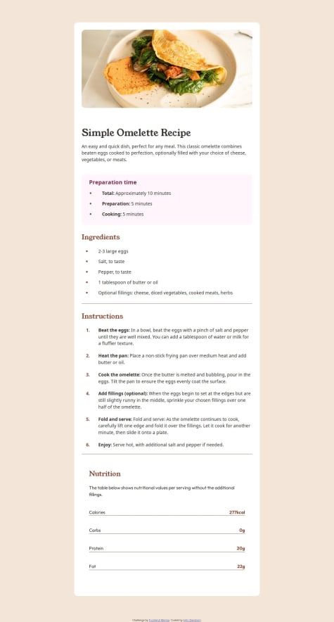
The alignment of the Nutrition card's second row, should be justified to the left. Here I used a diferent aproach. Isstead of a <ul> </ul> a used a <table> </table> and all its components. It was a good exercise for grid.
Cheers mate!