Austin
@AbsyntheeAll comments
- @bisbeecSubmitted 7 months ago
- @mukisapaulkSubmitted 7 months ago@AbsyntheePosted 7 months ago
The layout looks good - try to add the hover states to the project as shown in active-states.jpg. Keep it up! 😃
0 - @Kaung-Khant-Ko-KoSubmitted 9 months ago@AbsyntheePosted 9 months ago
Looks great! I like the decision you made to keep the testimonial icons square - it fits more with the rest of the blocky design aesthetic.
Something I've learned from these challenges is to try and make the page as accessible as possible. Disregarding the contrast of the design colours for accessible text standards (I didn't change this either!), you could improve accessibility by adding labels to your interactive elements - links, icons, etc.
Keep up the great work and good luck with future challenges!
Marked as helpful0 - @idatenkiddySubmitted 9 months agoWhat are you most proud of, and what would you do differently next time?
Now being able to make it little more responsive than my previous projects. Next time I will use Tailwind CSS cause i am tired of writing CSS.
What challenges did you encounter, and how did you overcome them?Not any a big challenge I encountered but real problem is it took me 1 hours to complete this which I feel its too late. I turned Learning section to a yellow button, idk if it is worth it doing that way or i could have just used a semantic tag.
What specific areas of your project would you like help with?Help me in making most responsive as possible.
@AbsyntheePosted 9 months agoLooks great! I don't think 1 hour is too long for this. I'm sure I spent a lot longer 😅. There isn't much more you can do for responsiveness on this challenge, but one thing you could add is the active state for the box shadow on the card - make it grow when the user is hovering over the card.
Keep up the great work and good luck with future challenges!
1 - @Rohanbasnet12Submitted about 1 year ago@AbsyntheePosted 9 months ago
Nice one! I like how you've organised your files and made comments for everything so it's easy to navigate.
Personally I would prefer if there was a max-width on the container holding your content, so the image doesn't grow so big and force users to scroll to read all the content.
Good luck with future projects!
0 - @amartadeviSubmitted 10 months ago@AbsyntheePosted 9 months ago
Looks good! I only have a couple of things to suggest if you want to update this challenge.
- Try to match the design as close as possible. You've done very well but the h1 stands out as being a lot larger in your version.
- Change the font color on the buttons when hovering. Currently they remain white which is pretty difficult for readability.
Overall, good job! Keep it up and good luck with your future projects.
Marked as helpful0 - @flexecuterSubmitted 10 months agoWhat challenges did you encounter, and how did you overcome them?
containers in containers ^^
@AbsyntheePosted 9 months agoLooks good! I only have a couple of notes for you to work on if you wish to update the project further.
- Update the font to match the design. You're currently using Arial instead of Figtree, but you do have the font files in your repository.
- Try to add the hover effects on your elements to match the active states. Without this, the page feels less dynamic and responsive. I see you do actually have some code to change the title colour on hover, but you have spelt the class name wrong. Try to use easy to identify names and keep them consistent.
Great start, keep it up for your future projects!
Marked as helpful1 - @ketab-coderSubmitted 10 months ago@AbsyntheePosted 10 months ago
Looks good! I only have a few tips for you, which should all be easy fixes or things to consider for your next challenge.
-
Make sure to match the provided design as closely as possible. The component is a bit small compared to the design file provided, and the font size is a few px smaller than in the style guide, probably to match the reduced scale.
-
Double check the copy. You don't want typos going to live versions! In this case you have "yout" instead of "your".
-
Make use of the custom readme when submitting your solution on github. It's useful for keeping track of what you've done, as well as for others who browse the project.
All small things, very nitpicky really! Keep it up and good luck with all future projects!
0 -
- @AbsyntheeSubmitted about 1 year agoWhat are you most proud of, and what would you do differently next time?
I didn't look up too much for this project, and I experimented with CSS nesting. Next time I'd hopefully just write the code much cleaner and more efficient.
What challenges did you encounter, and how did you overcome them?A simple design but it took a lot longer than expected. Mostly getting the image right on both desktop & mobile since it's a different image on each layout. I used two different divs and hid the one that wasn't needed. That is probably not the best way to do it, but it works!
What specific areas of your project would you like help with?Any feedback regarding CSS nesting, responsive flex, custom CSS properties... or just anything haha. All comments are appreciated. Thanks!
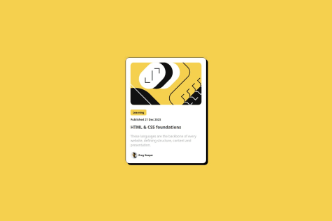
@AbsyntheePosted about 1 year agoNot sure why the image isn't previewing properly on the github page & in the screenshot above. You can see it in the screenshot in my repository here: https://github.com/Absynthee/product-preview-card-component-main.
Edit: fixed the above problem, but my new generated screenshot is not ideal!
Edit2: fixed above issue after generating new screenshot. Perhaps just some caching issue? Either way, happy with the result now.
0


