@mvellanichSubmitted about 2 months ago
99Abdel
@99AbdelAll comments
- @99AbdelPosted about 2 months ago
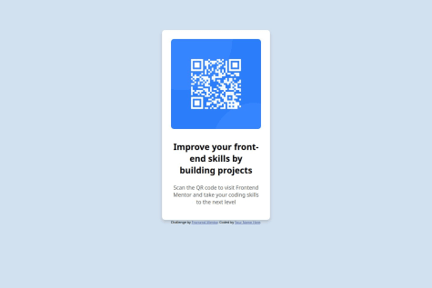
the main picture for desktop is larger than the model. the same applies for the version for smartphone. besides this it looks good, try to reduce the dimension of the bold text to it can get closer to the model one
0
