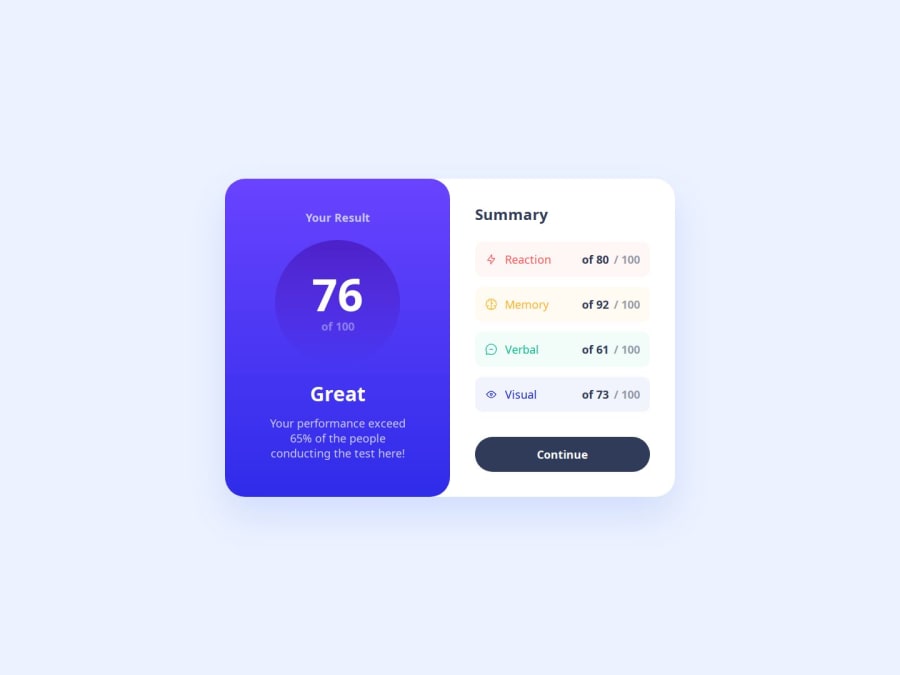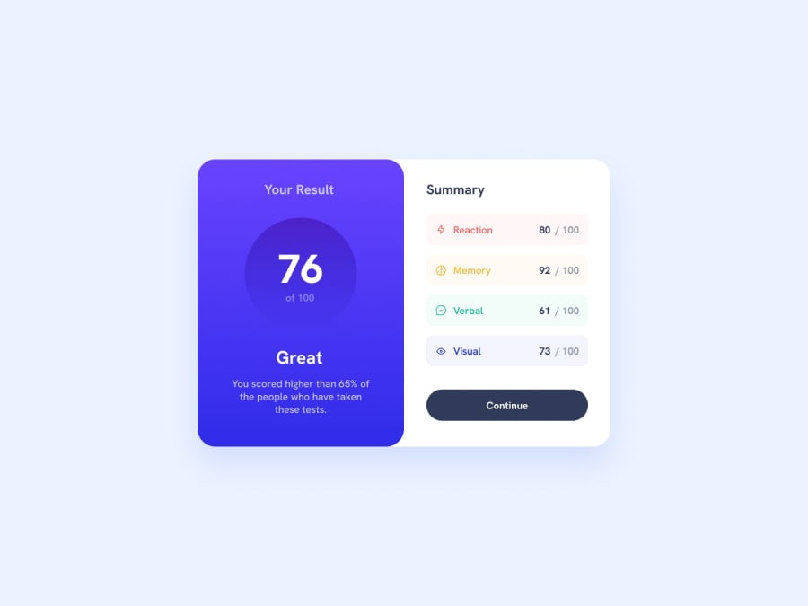
Design comparison
SolutionDesign
Solution retrospective
What are you most proud of, and what would you do differently next time?
The first chalange
Community feedback
- @MahmoodHashemPosted 9 months ago
Hey there! 🙋🏽♂️
Congrats on finishing the challenge! ✅
Your project looks awesome!
I have a suggestion to make your project more closely resemble the challenge.
- You can achieve this by adding rounded corners to the inputs using the
maskproperty in CSS. It's quite simple - just add the following style to your CSS file
.stats-list__item{
  --size: 20px;
  border: 2px solid #b3818444;
  background: #f2f2f2 content-box;
  mask: conic-gradient(#000 0 0) content-box,
    conic-gradient(at var(--size) var(--size), #0000 75%, #000 0) 0 0 /
      calc(100% - var(--size)) calc(100% - var(--size));
}
0 - You can achieve this by adding rounded corners to the inputs using the
Please log in to post a comment
Log in with GitHubJoin our Discord community
Join thousands of Frontend Mentor community members taking the challenges, sharing resources, helping each other, and chatting about all things front-end!
Join our Discord
