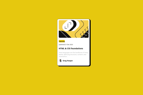
Not Found
Not Found
Not Found
Not Found
Not Found
Not Found
Not Found
Not Found
Not Found
Not Found
Not Found
Not Found
Not Found
Not Found
Not Found
Not Found
Not Found
Not Found
Not Found
Not Found

Submitted

yellow portfolio | Html and Css web page

@MamdohSamer

Desktop design screenshot for the Blog preview card coding challenge

This is a solution for...

  • HTML
  • CSS
1newbie
View challenge

Design comparison


SolutionDesign

Solution retrospective


What are you most proud of, and what would you do differently next time?

using simple html and css in this project

What challenges did you encounter, and how did you overcome them?

nothing, it was good challenge

What specific areas of your project would you like help with?

a normal portfolio for someone who loves basic layouts

Community feedback

P
Steven Stroud 11,810

@Stroudy

Posted

Exceptional work! You’re showing great skill here. I’ve got a couple of minor suggestions that could make this stand out even more…

  • Using a <main> tag inside the <body> of your HTML is a best practice because it clearly identifies the main content of your page. This helps with accessibility and improves how search engines understand your content.

  • Having a clear and descriptive alt text for images is important because it helps people who use screen readers understand the content, making your site more accessible. It also improves SEO, as search engines use alt text to understand the image's context, helping your site rank better, Check this out Write helpful Alt Text to describe images,

  • Using a full modern CSS reset is beneficial because it removes default browser styling, creating a consistent starting point for your design across all browsers. It helps avoid unexpected layout issues and makes your styles more predictable, ensuring a uniform appearance on different devices and platforms, check out this site for a Full modern reset

  • Using position: absolute is not always best practice because it removes elements from the normal document flow, making layouts harder to manage and potentially causing overlap or misalignment on different screen sizes. Instead, use flexible layout techniques like CSS Grid or Flexbox for more responsive and maintainable designs.

  • While px is useful for precise, fixed sizing, such as border-width, border-radius, inline-padding, and <img> sizes, it has limitations. Pixels don't scale well with user settings or adapt to different devices, which can negatively impact accessibility and responsiveness. For example, using px for font sizes can make text harder to read on some screens, Check this article why font-size must NEVER be in pixels. In contrast, relative units like rem and adjust based on the user’s preferences and device settings, making your design more flexible and accessible. Use px where exact sizing is needed, but prefer relative units for scalable layouts. If you want a deeper explanation watch this video by Kevin Powell CSS em and rem explained. Another great resource I found useful is this px to rem converter based on the default font-size of 16 pixel.

I hope you’re finding this guidance useful! Keep refining your skills and tackling new challenges with confidence. You’re making great progress—stay motivated and keep coding with enthusiasm! 💻

Marked as helpful

1

@MamdohSamer

Posted

Thanks for your comment. iam not so good at performance or responsive. I just try to make the web be like the design @Stroudy

1
P
Steven Stroud 11,810

@Stroudy

Posted

Hey @MamdohSamer, No problem, It is good practice to develop these practices early as this is how it is in the real world, You can still get the exact design with accessible in mind, I hope you found some of this information helpful, I look forward to seeing what you do next.

0

Please log in to post a comment

Log in with GitHub
Discord logo

Join our Discord community

Join thousands of Frontend Mentor community members taking the challenges, sharing resources, helping each other, and chatting about all things front-end!

Join our Discord