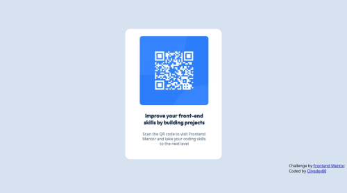
Submitted over 1 year agoA solution to the QR code component challenge
WR code page using HTML and CSS flex
@clivedev88

Solution retrospective
What are you most proud of, and what would you do differently next time?
I was able to adjust the container's size to fit different layouts. Next time I'd focus more on my CSS file, using grid or flexbox in order to make it happen faster.
What challenges did you encounter, and how did you overcome them?Making my initial design fit any layout.
What specific areas of your project would you like help with?Automatic layout fitting, because I think I made it fit, but it could be done easily. I just don't now how.
Code
Loading...
Please log in to post a comment
Log in with GitHubCommunity feedback
No feedback yet. Be the first to give feedback on Clive Kifumbi's solution.
Join our Discord community
Join thousands of Frontend Mentor community members taking the challenges, sharing resources, helping each other, and chatting about all things front-end!
Join our Discord