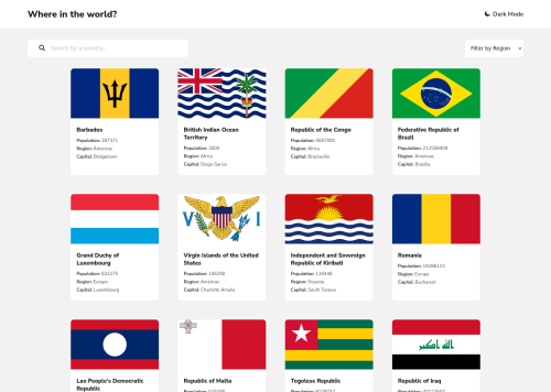
Design comparison
Solution retrospective
Any tips on improving this project is welcomed :)
Community feedback
- @ozzy1136Posted about 2 years ago
It looks pretty good, well done!
On my first look at your project, the first thing you need to do is remove the
width
property on the cards. Currently, you havewidth: 23rem
, but this makes the cards break out of the grid container. If you want each card to be a certain width and you are using CSS grid, you can setgrid-template-columns: repeat(auto-fit, minmax(23rem, 1fr))
on the grid container. Check out the MDN Web Docs for more information.Also, I would put the search container inside
<main/>
, since it is related to the cards and would make it an essential part of the document. Check out the MDN Web Docs for more information about HTML sectioning elements.Marked as helpful1@adetoye-devPosted about 2 years ago@ozzy1136 Thanks a lot for your feedback. I'll work on the changes you proposed :)
1
Please log in to post a comment
Log in with GitHubJoin our Discord community
Join thousands of Frontend Mentor community members taking the challenges, sharing resources, helping each other, and chatting about all things front-end!
Join our Discord