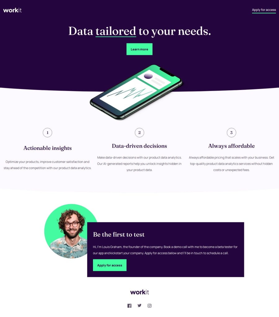
Design comparison
Solution retrospective
Even though I hate doing positioning like this, I am glad I was able to come up with a solution that I am okay with. Hopefully in the future I'll have a better solution in doing things like this.
What challenges did you encounter, and how did you overcome them?I had a hard time figuring out how to do most of the positioning stuff. Because of this, I wasn't able to finish adding the background images as I'm a bit checked out for today. I will consider adding them at a later time.
What specific areas of your project would you like help with?If someone could point me into an article or a yt video in regards with the following:
- Creating the arc like at the bottom of the div. I've search a bit and found that I could've use path but I couldn't grasp the values inside it so I just did a trial and error using pseudo-elements for now.
- The positioning of the founder section wherein you have an image and some text. I couldn't figure out to have a fully responsive solution so for now I opted out in doing some max-width of some sort so it doesn't look ugly at some breakpoints.
Any help in finding materials for the above is greatly appreciated!
Community feedback
Please log in to post a comment
Log in with GitHubJoin our Discord community
Join thousands of Frontend Mentor community members taking the challenges, sharing resources, helping each other, and chatting about all things front-end!
Join our Discord
