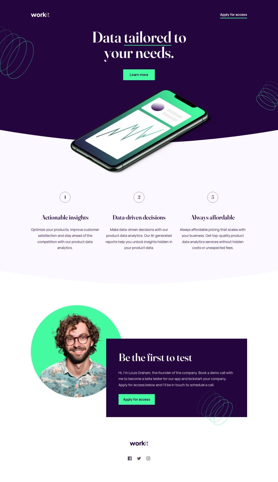
Workit responsive landing page ft. 11ty, CUBE CSS, and Tailwind


Design comparison

Solution retrospective
Yes, I finally tried Tailwind! I used it quite conservatively in conjunction with CUBE CSS, which means I still wrote component-based classes instead of taking a utility-first approach. But I definitely see the benefit of using Tailwind, especially for rapid UI development during the early phases of a project. I especially like how it can process design tokens and convert them into CSS custom properties that I can use in my code.
The source code of Build Excellent Websites is my primary inspiration for this project. I tried my best to practice the principles in that site, which is why I only used 2 media queries for this solution (not counting the ones in resets and config files). The rest of the layout are handled by utility classes, such as the Switcher a.k.a. the Flexbox Holy Albatross by Heydon Pickering.
I think I also gained more confidence working with SVG:
- For the logos, I used inline SVG in the header and footer instead of
<img>tags. - I combined the social media icons into an icon sprite embedded in the page, which avoids extra HTTP requests.
I still have to add those oval/spring patterns, but other than that, it's almost done.
Please let me know what you think! Do you think I could've used Tailwind more effectively for this project? Any feedback on code structure/organization?
Community feedback
- @mandriva19Posted almost 2 years ago
very impressed with this solution. it's clean and responsiveness is on point. the way project is structured is peaceful @ ~
thanks for providing helpful resources!
also the hardest part of completing FEM challenges for me, is positioning background images on the responsive layout. seems like you have nailed that with calc function, I usually write 40 lines of css and it's still breaks xD
.... Just opened the page if Firefox (latest) and it renders content quite weirdly. https://i.imgur.com/WzRsT8k.jpg
Good luck!
Marked as helpful1@joshjavierPosted almost 2 years agoThank you for the feedback, @mandriva19! I'm happy that the resources I've stumbled upon have helped a fellow developer. :)
And I agree that placing background images are such a pain. I got lucky on this one, but the process of trying different approaches until you find what works can be really frustrating. Either you give up or things magically work and you don't know why 😂
As for the weird Firefox rendering, not sure but maybe it's cache-related. I think this is when I added the oval background patterns which caused my layout to break, so I had to fix it in a later build. Try clearing your cache or pressing Ctrl+Shift+R to do a hard reload, that usually fixes it.
1

Please log in to post a comment
Log in with GitHub
Join our Discord community
Join thousands of Frontend Mentor community members taking the challenges, sharing resources, helping each other, and chatting about all things front-end!
Join our Discord