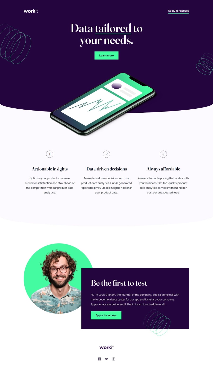
Design comparison
Solution retrospective
The detail I'm most proud of is something most people probably won't notice. The Figma design file indicates that the primary button has an outline that is a pixel wide when it's in a hover/focus state, and said outline has angled corners. I'm not too familiar with using clip-path, but I was able to replicate this outline (with the following code playing a part in that):
.button__primary {
    &:hover, &:focus {
        clip-path: polygon(
            -1px 0px,
            0px -1px,
            100% -1px,
            calc(100% + 1px) 0px,
            calc(100% + 1px) 100%,
            100% calc(100% + 1px),
            0px calc(100% + 1px),
            -1px 100%
        );
        outline: 1px solid var(--green);
    }
}
(If you zoom in really far, you might see it!)
I'm not sure that my methods for positioning the background patterns and for creating the rounded ornamental borders were the best. I also think there must be a better way to set the positions of the ordered list. If I were to try this challenge again, I would give those aspects more consideration.
What challenges did you encounter, and how did you overcome them?Creating the different layouts for the value list took some time. Since it uses display: flex, custom list item numbers were inserted using :before, which wasn't new. However, generating the numbers for the list items involved some CSS I hadn't used before: counter values.
.value__list {
    //Initializes the counter named "value"
    counter-reset: value;
}

.value__list_item {
    //Increments the counter named "value" with each list item
    counter-increment: value;

    &:before {
        //Provides the counter to the list item
        content: counter(value);
    }
}
Near the end of making this solution, I found that the text-decoration shorthand is not as widely supported as I thought, and the way a text underline is displayed can vary from browser to browser, so I made sure to set all relevant values explicitly and separately:
text-decoration-color: var(--green);
text-decoration-line: underline;
text-decoration-thickness: 3px;
text-underline-offset: 0.375rem;
I would like to know what the best method is for creating the curved ornamental borders. I tried clip-path and ended up using border-bottom-left-radius / border-bottom-right-radius, but I found that any of those options seem a little too curved on the ends, compared to the requested design.
Community feedback
- @grace-snowPosted 6 months ago
This looks really good in browser on mobile, well done!
There are some problems though, particularly in terms of accessibility.
- the header logo and one link does not constitute a
navelement. That's belongs in aheaderoutside of main. Remember that header can be given its own background colour. - the logo alt must just say the same text as the logo, nothing more.
- the apply links are links not buttons. Same with the learn more link.
- it's generally not good practice to include empty divs. Try to use pseudos instead if possible.
- add lazy loading to those background img elements for a small performance boost.
- the social link labels aren't right at the moment. Voice control users would struggle to activate those because you've made them too verbose. Instead of "visit us on..." Just have the social platform name and the opens in new tab warning.
- the inline svgs need
focusable="false" aria-hidden ="true". - I’d need to check in a browser so I can zoom normally but on mobile zoom this breaks very badly at the moment. The main cause is use of explicit heights especially on the nav/header and that it doesn’t wrap when it needs to. I’ll add some images to discord to show you what I see when zooming text on iPhone. UPDATE: I checked in browser and this does reflow OK in normal zoom (so meets the minimum WCAG requirement) but breaks badly when zoomed further than the minimum on a small screen or text is enlarged. A lot of people need to be able to do that, especially older people who often need larger text to be able to read content. That's why we recommend against limiting heights and why I recommend defining media queries in rem or em not px.
- one definite and serious accessibility problem is the clamped font sizes. That middle value must be converted to rem, it must not be a viewport unit only! That makes the site immediately far less accessible because people will be unable to change the text size.
- overall I am concerned at the amount of complexity in the styles for this. I wouldn't expect all of these explicit widths, styling on ID selectors, and heights. But I'd need to inspect in a browser to see the full implications. It's very hard to read.
Marked as helpful2P@law973Posted 6 months ago@grace-snow Thanks! I appreciate the in-depth analysis, and have made some sizable changes that include the following:
- Moved "nav" contents into
header, removednavtags, addedflex-wrap - Fixed logo alt text
- Changed primary and secondary buttons to links
- Removed empty divs, changed curved borders from using
clip-pathto usingborder-bottom-left-radiusandborder-bottom-right-radius - Added lazy loading for background patterns
- Fixed social link labels
- Added
focusable="false" aria-hidden ="true"to inline SVGs - Removed explicit heights/widths, fixed zoom breakage (I think)
- Updated all instances of clamp (including fonts)
- Removed unneeded lines, media queries, IDs, and ID selectors
- Moved paragraph styling to reset
- Removed usage of SCSS extends and unnecessary classes/clutter (e.g.
.footer) - Styled classes in the order of usage (instead of alphabetically) and added comments to try to improve readability
- Simplified the way background pattern positions are changed
I may try getting pseudos to work for the curved borders in the future. I also noticed your update while typing this and I will look into defining media queries using rem.
0 - the header logo and one link does not constitute a
Please log in to post a comment
Log in with GitHubJoin our Discord community
Join thousands of Frontend Mentor community members taking the challenges, sharing resources, helping each other, and chatting about all things front-end!
Join our Discord
