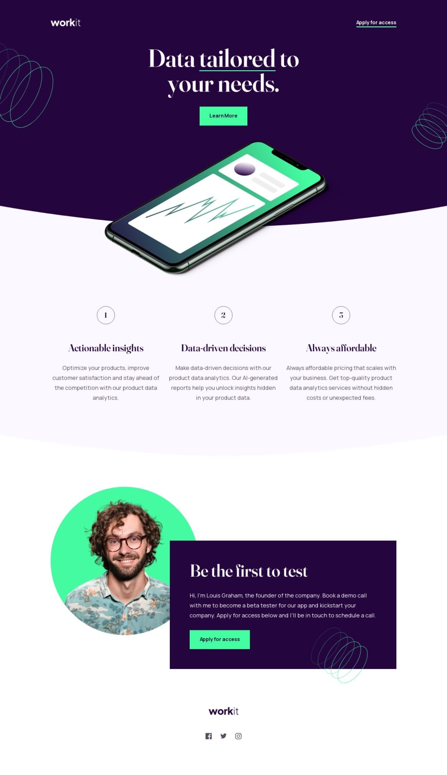
Workit Landing Page using NextJS with Storybook
Design comparison
Solution retrospective
- Storybook link: https://6452308a4acb569264081653-vdctbqoyfh.chromatic.com/
Community feedback
- @VijayAbbaPosted over 1 year ago
Hey, nice work.
Could you tell me how you made the exact arc at the bottom of the hero section?
It was awesome , I have read through your code and I have seen you have used ::before , but I did not understand how you did the exact arc ,
In this case, I have used border-bottom-left and right radiuses.
I've been scratching my head and googling. Could you send me any reference or link. Thank you
0@HanSeongLeePosted over 1 year agoHi, @VijayAbba
I solved this problem by vector images.
Here's a simple way to solve it:
- Export arc images from Figma.
- Set the background image to the section
- Set the background size to cover.
- What you need is the bottom part of the arc, so you set the background position to bottom.
This is a simple way to draw an arc.
I added some code to prevent the arc from getting flatter when the browser is resized on mobile. To prevent the arc from changing, the background size was set to contain on mobile and the empty space was filled with color using ::before.
I hope you make this helpful. Happy coding!
1
Please log in to post a comment
Log in with GitHubJoin our Discord community
Join thousands of Frontend Mentor community members taking the challenges, sharing resources, helping each other, and chatting about all things front-end!
Join our Discord