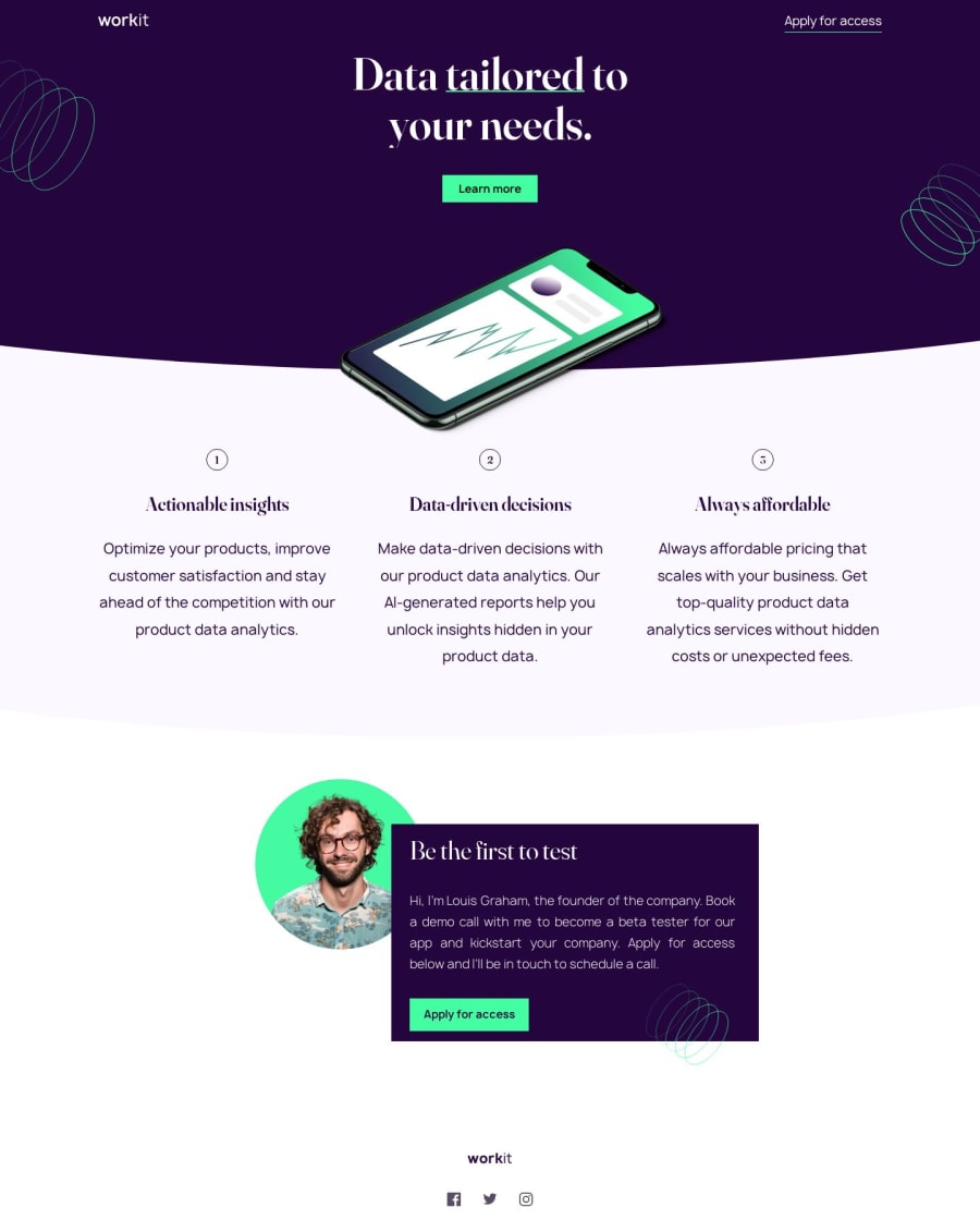
Workit Landing Page: SASS, CSS grid, flexbox and position.
Design comparison
Solution retrospective
I found this project difficult in parts. I would’ve liked to use more semantic html; but wasn’t sure where this would have been appropriate, so I opted for divs instead.
CHAT GPT recommended using the section element for “hero__section”, “banner__absolute”, “middle__section”, and “bottom__section”; although I’m not sure if this would have been the correct approach. It also suggested using the article element within “flex__container” for each of the three boxes (which are shaped with grid, by the way.) If anyone could provide some more info on the proper use of semantic html in this context, that would be great !
For the “middle section” I had to position: relative; and z-index: -1 while also playing with margin-top / padding-top in order to get into to smoothly sit below the purple section above with the curved bottom. If anyone has any ideas on how to do this more efficiently, I would love to find out.
I had difficulty using the fonts with the @font-face method; I tried this in multiple iterations, but still couldn't get it right. If someone could provide some help with this, it would be much appreciated. Eventually, I used the links in my header as a way around this difficulty.
I would love to hear any feedback, critical or otherwise.
Regards, Dilhan Boca [email protected]
Community feedback
Please log in to post a comment
Log in with GitHubJoin our Discord community
Join thousands of Frontend Mentor community members taking the challenges, sharing resources, helping each other, and chatting about all things front-end!
Join our Discord
