Not Found
Not Found
Not Found
Not Found
Not Found
Not Found
Not Found
Not Found
Not Found
Not Found
Not Found
Not Found
Not Found
Not Found
Not Found
Not Found
Not Found
Not Found
Not Found
Not Found

Submitted

Workit Landing Page

P

@kaamiik

Desktop design screenshot for the Workit landing page coding challenge

This is a solution for...

  • HTML
  • CSS
1newbie
View challenge

Design comparison


SolutionDesign

Solution retrospective


What are you most proud of, and what would you do differently next time?

This challenge was a landing page that has different parts and using media query properly is really important in this challenge.

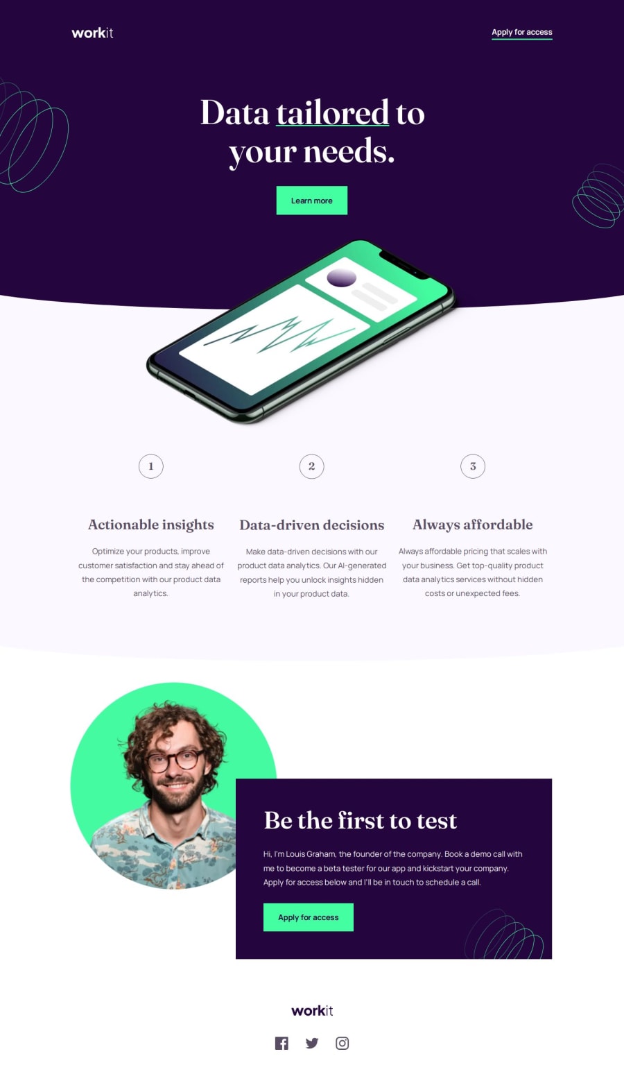
What challenges did you encounter, and how did you overcome them?

  • Aligning the images on this page was very tough for me.

What specific areas of your project would you like help with?

  • First, is my HTML structure correct? Could it be improved? I’d appreciate any suggestions.

  • Regarding the alignment of the phone image, I used negative margins and adjusted visibility with a media query. Is this approach correct?

  • In general, can I write my CSS code more concisely? Which parts should I consider removing?

  • Do you have any recommendations for better coding structure in this challenge?

  • Additionally, for added convenience, I’ve created some functions using Sass mixins. Is this a good practice?

Community feedback

matbac85 600

@matbac85

Posted

It seems to me that you've done a great job! I remember doing this challenge and it was deceptively simple.

I see in your CSS code that you write your media queries at each stage, I imagine that's because you're thinking about the three screen sizes and how the elements evolve as you go along, but isn't it safer to put your media queries at the very end?

I've seen that you've liked all my challenges. Thank you for your support!

Keep up the good work!

0

P

@kaamiik

Posted

Hi. Yes It was some how challenging for me. specially for the background images and the curve section dividers. For using media query I'm using a mixin with sass and use it whenever I need. This is the mixin code.

$breakpoints-up: (
  "medium": "48rem",
  "large": "75rem",
  "xlarge": "90rem",
);

@mixin breakpoint($size) {
  @media (min-width: map-get($breakpoints-up, $size)) {
    @content;
  }
}

And I use it like this

.header {
  padding: 0 rem(24);
  padding-top: rem(40);

  @include breakpoint(medium) {
    padding: 0 rem(39);
    padding-top: rem(62);
  }

  @include breakpoint(large) {
    padding: 0 rem(165);
    padding-top: rem(62);
  }
}

After the compiling to css you see the media on each stage. I think It is more readable and easier to write for me.

Your welcome. Thank you too @matbac85

0

Please log in to post a comment

Log in with GitHub
Discord logo

Join our Discord community

Join thousands of Frontend Mentor community members taking the challenges, sharing resources, helping each other, and chatting about all things front-end!

Join our Discord