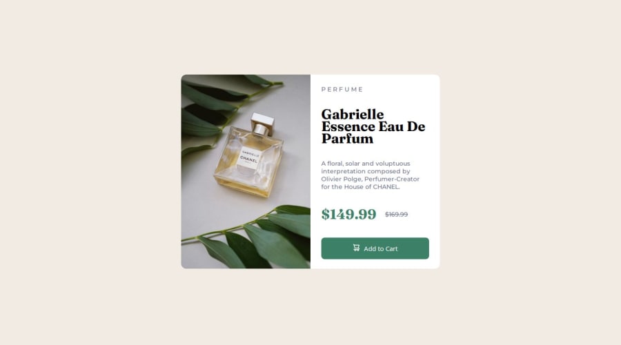


Design comparison
SolutionDesign

Community feedback
- P@oridrPosted 24 days ago
Desktop and mobile exact sizes look good. The problem is the sizes between them. To avoid the need to declare multiple media queries, you can the sizes more fluid by using
clamp()orwidth: min()with relative values (percentages for example) to make thewidthmore fluid, and static values (PX for example) to define the limits.You should also use more REMs than PX to respect the base font size set by the user, and allow elements to resize on zoom.
Marked as helpful1

Please log in to post a comment
Log in with GitHub
Join our Discord community
Join thousands of Frontend Mentor community members taking the challenges, sharing resources, helping each other, and chatting about all things front-end!
Join our Discord