Submitted almost 2 years agoA solution to the Social links profile challenge
Working exercise but I need help.

@ArthurResendeC
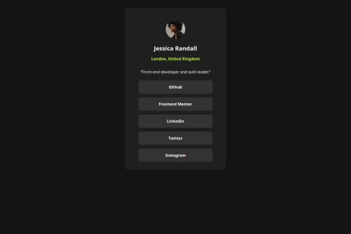
Solution retrospective
I don't know how to make stuff smaller.
That's basically my main issue here, I think the current result is ok, but I have no idea on how to improve it or where are the mistakes on it.
If anyone could point what is wrong, right, and what I should try to study from now on I'd be really grateful!
Code
Loading...
Please log in to post a comment
Log in with GitHubCommunity feedback
No feedback yet. Be the first to give feedback on Arthur Resende's solution.
Join our Discord community
Join thousands of Frontend Mentor community members taking the challenges, sharing resources, helping each other, and chatting about all things front-end!
Join our Discord