WordWise: A Responsive Dictionary App Built with Next.js and Tailwind
Design comparison
Solution retrospective
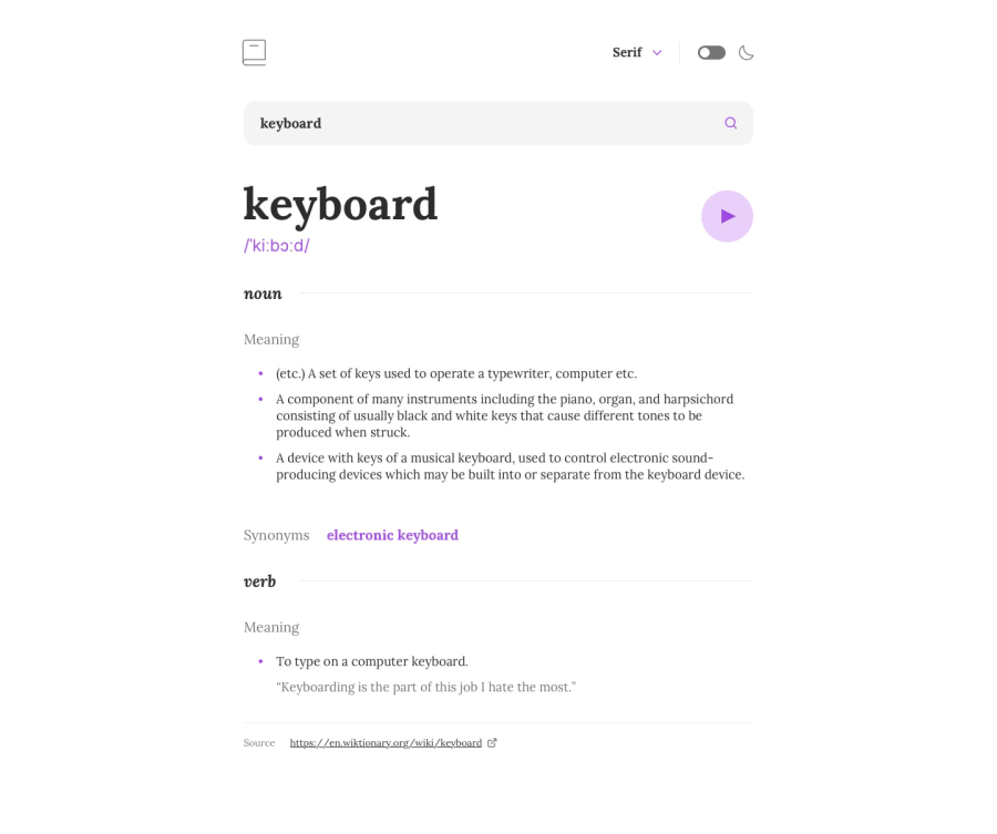
Reflecting on this project, I take pride in several key achievements. Firstly, I significantly improved the design system, particularly in defining the styles for titles and body elements. This clarity not only enhances the visual appeal but also ensures a consistent user experience throughout the application. 🌟 Additionally, I implemented a direct Google search feature for synonyms, which adds immediate value and functionality for users looking to explore word meanings further. 🔍
While I am proud of these advancements, there are aspects I would approach differently in future projects. For instance, I would focus on enhancing accessibility features to ensure that all users can navigate and utilize the app effectively. ♿
Furthermore, I would consider integrating more dynamic content options, such as user-generated word lists or personalized vocabulary tracking, to foster greater engagement. 📚 Lastly, refining my use of Tailwind CSS utilities could streamline my styling process even further, ensuring that my code remains clean and maintainable as the project scales. 🚀
What challenges did you encounter, and how did you overcome them?During the development of my dictionary web app, I encountered several challenges that tested my problem-solving skills. One significant challenge was mapping the proper information into the UI in a structured format. Ensuring that data was displayed clearly and intuitively required careful planning and iteration. To overcome this, I focused on creating a clear layout and utilized components effectively to organize the information, allowing for a more user-friendly experience. 🛠️
Another challenge was implementing Dark Mode. The complexity arose from the need to manually adjust each element to ensure it looked good in both light and dark themes. 🌗 This process was time-consuming and required meticulous attention to detail. To address this, I researched best practices for theming in Tailwind CSS and began implementing a consistent approach across components. Moving forward, I plan to explore Tailwind's built-in Dark Mode features more thoroughly, which could streamline this process and make future implementations more efficient. ⚙️
What specific areas of your project would you like help with?I would appreciate help in a few specific areas of my project. Firstly, I’m looking for guidance on optimizing the mapping of information within the UI to ensure that data is presented in the most effective and user-friendly way possible. Any insights or best practices for structuring data visualization would be incredibly helpful! 📊
Additionally, I would like assistance with the implementation of Dark Mode. Since I found it quite complex to manually adjust each element, any advice on leveraging Tailwind CSS’s built-in Dark Mode features or resources on best practices for theming would be invaluable. 🌈
Overall, any help or suggestions in these areas would greatly enhance my project and contribute to its success! Thank you! 😊✨ Feel free to adjust any emojis or phrases to better match your style!
Community feedback
Please log in to post a comment
Log in with GitHubJoin our Discord community
Join thousands of Frontend Mentor community members taking the challenges, sharing resources, helping each other, and chatting about all things front-end!
Join our Discord
