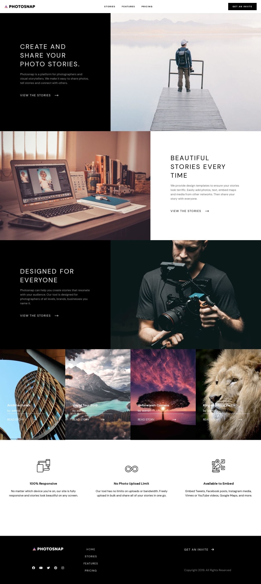
WordPress website using Advanced Custom Fields
Design comparison
Solution retrospective
This is another challenge that I've completed. This time I used WordPress and Advanced Custom Fields (ACF) to develop the website. As well as on other projects, I've been using Tailwind CSS and Vanilla Javascript.
Due to restrictions about where a project can be uploaded, I had to generate an HTML version of the WP theme I developed and uploaded it on a separate repository.
I'd really appreciate your feedback.
Community feedback
- P@a1excpunkPosted almost 2 years ago
Good job, but some style issues were noticeable,
- on the main page cards text is shifted to the side, if the width of the screen is more than 1440 (I was not checking intentionally, it happened that I saw your solution on a bigger screen.)
- same issue as above but on the stories page, but here not the text is shifted but the whole cards grid behaves a bit off.
I guess it was a 1440 limitation in the guidelines, but if you put a limitation, put it globally, so some parts "don't know" screen is wider. (in this case, the grid container knew so it went on but the cards didn't adjust)
and 3. on the pricing page, the toggle transform between monthly and yearly is a bit off.
keep going and once again, good job.
Marked as helpful0@lirapanciPosted almost 2 years agoHii there @a1excpunk,
I appreciate you taking the time to review my work. I found the comments helpful and for future projects, I'll double-check the larger screens too. :) The changes are now reflected :) Thanks again!!!
1 - @Daniels-notPosted almost 2 years ago
Hello Lira,
I wanted to share my feedback on the design and final version of the website you developed. Overall, the web page looks fantastic, and I am impressed with the work you have done.
However, I noticed a small inconsistency between the design and the final version. In the design, the font was supposed to be bold and slightly larger in size. Although the current version is excellent, I believe applying these adjustments would further enhance the overall aesthetics and user experience.
I want to emphasize that your skills and talent are evident in the exceptional quality of the website. It's clear that you put a lot of effort into its development, and it has turned out to be amazing. I truly appreciate your dedication and hard work.
Thank you for your attention to detail and for creating such an outstanding web page. I have no doubt that it will make a positive impact. I look forward to seeing the updates with the bold font and slightly increased size.
Keep up the excellent work!
Best regards, Ramy CV
0@lirapanciPosted almost 2 years agoThank you for your comments. The changes are now reflected :) @Daniels-not
1
Please log in to post a comment
Log in with GitHubJoin our Discord community
Join thousands of Frontend Mentor community members taking the challenges, sharing resources, helping each other, and chatting about all things front-end!
Join our Discord
