Design comparison
Solution retrospective
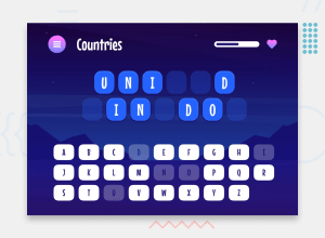
This challenge was interesting. Next time, I would like to improve my approach to implementing responsive layouts and pay closer attention to following the design more accurately. Also, I haven't used a "selected" field in the data, so I am thinking of using it to avoid repetitive occurrences of words in the game section.
What challenges did you encounter, and how did you overcome them?One of the challenges that comes to mind is creating a reusable popup component that functions properly and looks different depending on its purpose achieved through conditional logic.
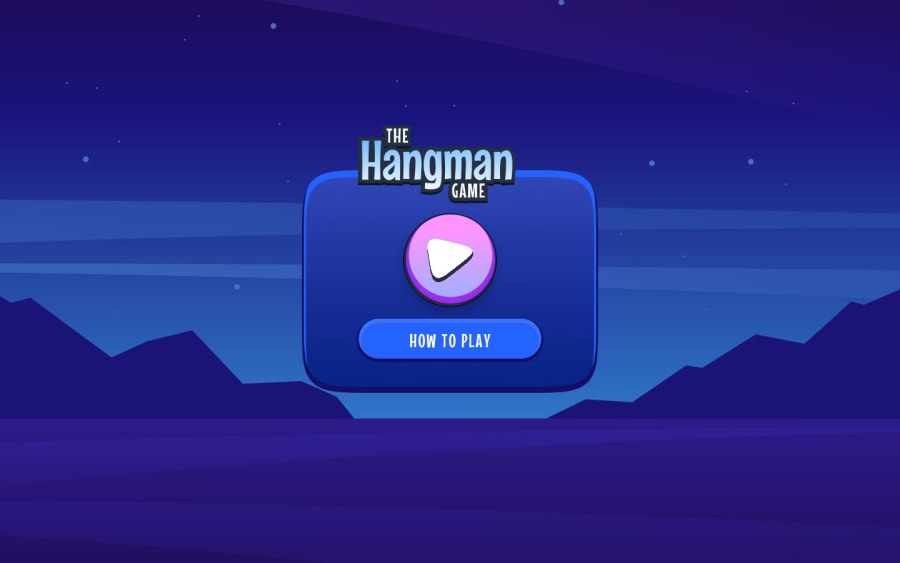
To tackle this, I developed a popup component using React and styled-components, utilizing a mode prop to manage the component's behavior and appearance according to different game states. It dynamically adjusts its content and style based on the mode provided. For example, it shows a play button, "how to play button" title in "start" mode, game instructions in "rules" mode, shows different titles in "win" or "lost" mode etc
Also it took some time for me to fix flashing of unstyled content (this issue is called FOUC) that happened on the first load, the best solution was to check nextjs documentation regarding styled-components
What specific areas of your project would you like help with?Using images as background for the buttons, popups and other elements slow down the loading. I tried serving images with nginx, but it didn't help much to improve loading speed. What are other options besides optimizing images?
Community feedback
Please log in to post a comment
Log in with GitHubJoin our Discord community
Join thousands of Frontend Mentor community members taking the challenges, sharing resources, helping each other, and chatting about all things front-end!
Join our Discord
