with Next.js, React, TypeScript, TailwindCSS
Design comparison
Solution retrospective
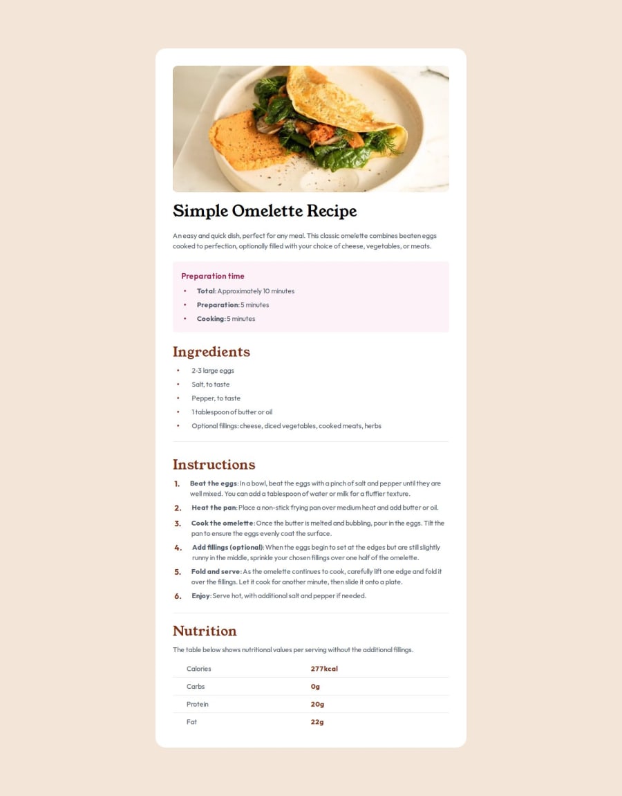
The actual design was adjusted so that the position of the text was approximately the same as the actual design photo.
What challenges did you encounter, and how did you overcome them?"Flexbox" is specified for each lists to make the space between the text and bullet points.
What specific areas of your project would you like help with?The CSS classes to make the space between bullet points and text was not clean because it has many repetitions. I want to learn from others' examples how it could have been written elegantly.
Community feedback
- @pabl-cruzPosted 6 months ago
interesting use of the background image styles in the extended styling inside the config file. maybe you could save some repetition in the list classes by adding extended general styles creating a new custom class.
0
Please log in to post a comment
Log in with GitHubJoin our Discord community
Join thousands of Frontend Mentor community members taking the challenges, sharing resources, helping each other, and chatting about all things front-end!
Join our Discord
