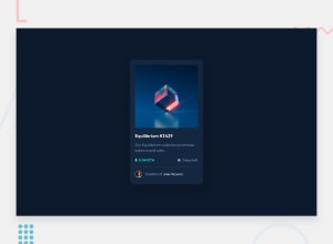
Design comparison
Solution retrospective
This tell me about your thoughts, it will help for improving my skill set
Community feedback
- @AlexKMarshallPosted about 3 years ago
Visually this looks good so long as the screen is big enough. It has overflow on screen sizes smaller than about 350px though.
The main thing that will fix that is not using fixed widths or heights in your code. Let the content determine how big something can get. You can use a
max-widthto stop things getting too wide.The heading and main content semantics are good. But I'm not sure why the price and the duration are links, I don't think in a real app they'd go anywhere.
Conversely both the heading, and the creator name should be links, as they would go somewhere, and you're providing an indication of interactivity with the
:hovereffect.The image ought to be wrapped in a button, as it's implying when you click on it something is going to happen (presumably opening it in a larger modal or lightbox or something)>
Avoid using
pxas a unit forfont-size. For accessibility reasons we want users to be able to change their browser font-size, and have our site respect that. When you set a fixed size inpxthis is prevented. Instead always useremorem.Marked as helpful1
Please log in to post a comment
Log in with GitHubJoin our Discord community
Join thousands of Frontend Mentor community members taking the challenges, sharing resources, helping each other, and chatting about all things front-end!
Join our Discord
