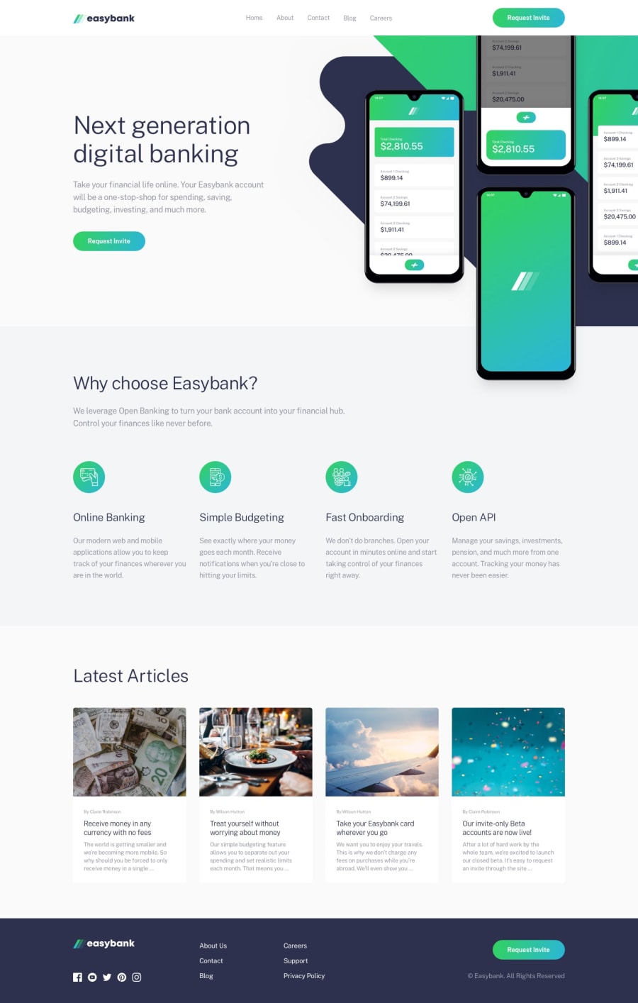
Design comparison
Solution retrospective
Messed up pretty badly making the base HTML for the hero section (namely getting the image positioning right while keeping things in a max width since i'm unsure of the design on larger monitors) to the point it would take too long to make responsive for smaller devices. Will recreate some other time.
This is just a personal note, but if you have any suggestions on how you did the hero section please let me know :)
OG first attempt link: https://sumner-david.github.io/Easybank-Landing-Page/src/index.html
====================================
Update 16 months later: Redone all the work and completed all the other parts using TailwindCSS and GULP as my task runner. Looking much better on screens and mobile.
My only issue was like last time, the hero section due to the overlapping content suddenly shifting to not overlap onto mobile. Found this part very hard to do and was tempted to just hide a component and only show on mobile but chose to see if i could make a single responsive component. Looks awkward in some tablet sizes but works on other sizes
Curious to hear how other people managed the hero section responsiveness! 😁
Community feedback
Please log in to post a comment
Log in with GitHubJoin our Discord community
Join thousands of Frontend Mentor community members taking the challenges, sharing resources, helping each other, and chatting about all things front-end!
Join our Discord
