
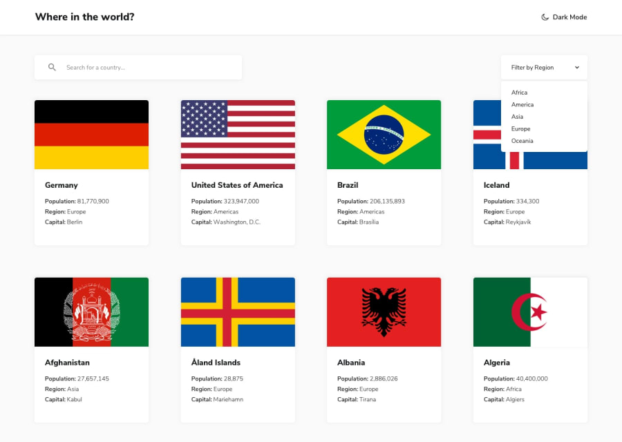
Where in the world with Next, Typescript and Tailwind. Dark Mode + API

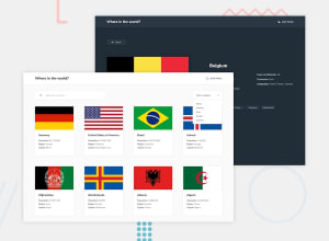
Design comparison
Solution retrospective
I had a lot of fun doing this challenge. Once again, Frontend mentor comes up with the educational goods. I Got to learn how to make a dark theme with Tailwind and next-themes. I Got to build out a big typescript interface for the API data. I decided to give Tailwind another go, It definitely makes styling fast, despite the extra clutter in the .tsx files.
Thanks Frontend Mentor!
Community feedback
- @AlekseiBestuzhevPosted over 1 year ago
Hello.
-
Try to open China and you will see the error. This is due to the fact that you are using the search by name. From the documentation: "Search by country name. If you want to get an exact match, use the next endpoint. It can be the common or official value". China and Taiwan have the match in the official name, and in the response array from the server, Taiwan comes after China and displays Taiwan. Same situation with South Georgia and Georgia.
-
When I open Antarctica, the app crashes. Check the console.
-
Not all properties exist in all countries, this should be taken into account in the typing. The capital of Antarctica, for example. You need to handle their absence.
-
Images on the main page have different heights.
-
When I use the region filter, the selected region is not displayed. There is no way to reset the filter. I would also advise not to make a new request, instead it is better to filter.
-
Missing region Antarctica.
Well done for completing this challenging project. Good luck!
Marked as helpful0@timbosToursPosted over 1 year ago@AlekseiBestuzhev thank you for your feedback, I have implemented the functional changes you recommended and added a few extras to improve the page. Thank you for bringing the errors to my attention. The only thing I haven't done is set heights for the flags. If I do this it cuts off a lot of the flags. Countries like Vatican city and Nepal have really tall flags compared to the other countries and setting fixed heights means you can barely see them, as it does in your solution for this challenge. This does mean I get inconsistency in the cards but I have done my best to mitigate this by making sure the texts sections line up as best as possible. Looks like we have a good old fashioned trade off.
Thank you for again for the feedback, It has pushed me to do better and I love that!
Cheers!
0@AlekseiBestuzhevPosted over 1 year ago@timbosTours In my opinion, the developer should organize the UI so that nothing could break it. If there is a vertical picture, then one row of cards will stretch out very much and it will not look very attractive. It seems to me that the proportions of images should be monitored by those who upload them to the server, and we are making a reliable application. But still, there are no very high images here yet, so this solution is a compromise.
Thanks for explaining your point of view. All the best!
0 -

Please log in to post a comment
Log in with GitHubJoin our Discord community
Join thousands of Frontend Mentor community members taking the challenges, sharing resources, helping each other, and chatting about all things front-end!
Join our Discord