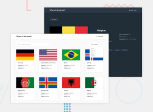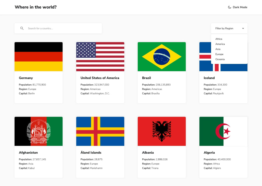
Design comparison
Solution retrospective
Hey everyone!
This was a nice project to build. I have used ReactJS to build the solution. Although, there wasn't much React required for the output but using it has helped me to fasten the progress. Managing state and efficiently looping through the data to reuse components has been greatly facilitated by React.
For the Theme Switcher, I have made use of Local Storage as it allows to persist theme on refresh. I have also changed the icon between light-mode and dark-mode.
On the filter, I have added a 'Remove' button that can be used to remove the applied filter. Although, this wasn't in the design but I thought it would be an essential aspect to implement.
Lastly, I have also added pagination to the project and used alphabets to categorize the items. This allows us to travel to the required page in an efficient way.
Any feedback, comments, suggestions are welcomed!
Thanks, Nikhil Tanwar
Community feedback
Please log in to post a comment
Log in with GitHubJoin our Discord community
Join thousands of Frontend Mentor community members taking the challenges, sharing resources, helping each other, and chatting about all things front-end!
Join our Discord
