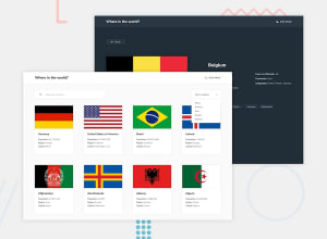
Where in The World project built with HTML/SCSS/Javascript/Vite
Design comparison
Solution retrospective
I had a hard time doing this project only In HTML and CSS (Sass for nesting and folder management). Any Critics and identification of flaws are appreciated
Community feedback
- @NickBankenPosted over 2 years ago
Love the animations and the little details in your project, well done!
Here are some tips that you can look further into:
JS :
-
Try to avoid global variables, and make functions that tell you what they are doing (you are already doing that on some parts)
-
You can make for example create a fetch function and re-use this wherever needed by passing the URL as parameter.
-
For optimization rather than fetching every-time on using the drop-down filter, fetch the data once and store it in an array. re-use this array to filter through it and create a new "filtered" array, it will use less resources doing it this way.
CSS:
-
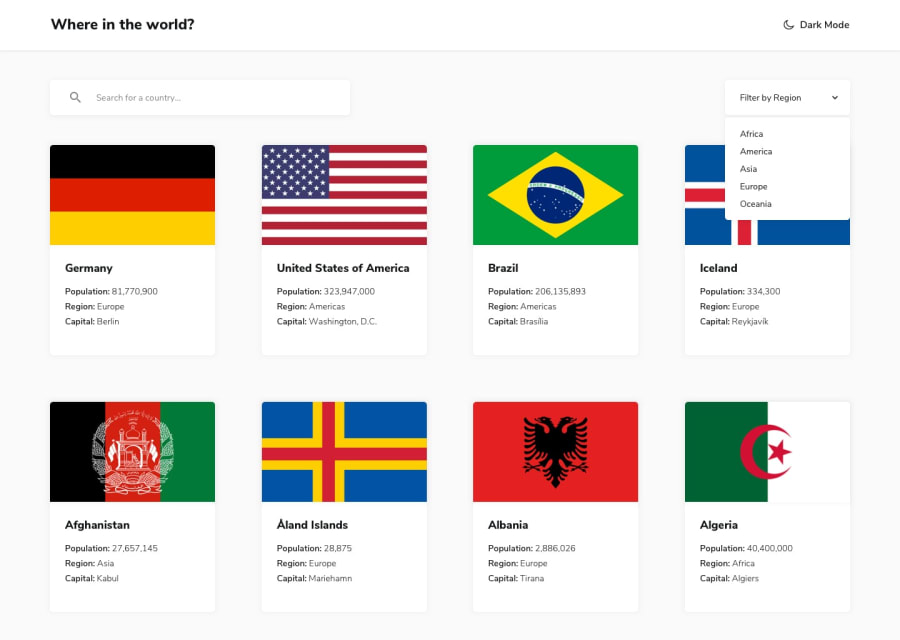
You see that the cards are expanding and the heights are different, It's because some flags are bigger than other flags. Perhaps set a height on the container of a flag and put "Object-fit:cover" on the image.
-
And for the drop-down, I'd give it a fixed width, so that it does not change when the user changes the filter. (Also "All" makes more sense as user then "Reset")
Happy coding and good luck! :)
0 -
Please log in to post a comment
Log in with GitHubJoin our Discord community
Join thousands of Frontend Mentor community members taking the challenges, sharing resources, helping each other, and chatting about all things front-end!
Join our Discord
