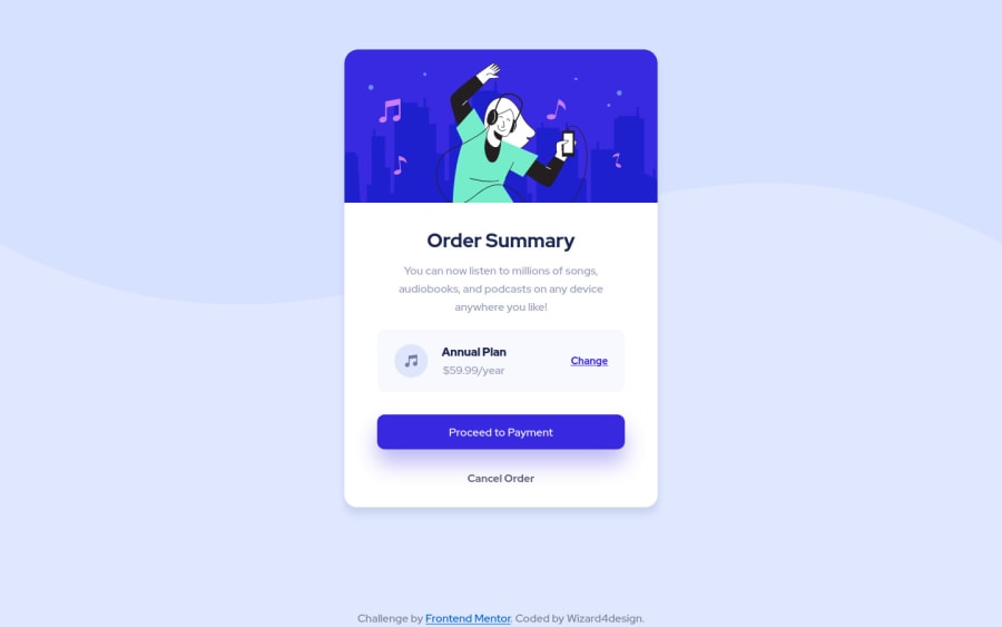
Design comparison
SolutionDesign
Solution retrospective
If you can change 2 things, which they will be?
Community feedback
- @elidrissidevPosted over 3 years ago
Hey! Great job with this one! I actually have 5 things 😅:
- Avoid skipping heading levels, you went from
h1toh4. You should always go from 1 to 6. You can always style them differently if they don't match your design. - I would wrap
<div class="attribution">inside afooterelement since it's more meaningful. - For the illustration image, since it's purely for the look, I would keep
altempty to make it clear for assistive technology that it's a decorative image so they won't read the alt text. - Consider using classes to style your HTML elements instead of directly referencing them, it's reusable, more readable and overall a better practice for bigger projects.
- I would stay away from absolute units like pixels because they're not responsive and don't scale when browser's font size increases/decreases.
I hope this didn't overwhelm you. Good luck!
Marked as helpful0 - Avoid skipping heading levels, you went from
Please log in to post a comment
Log in with GitHubJoin our Discord community
Join thousands of Frontend Mentor community members taking the challenges, sharing resources, helping each other, and chatting about all things front-end!
Join our Discord
