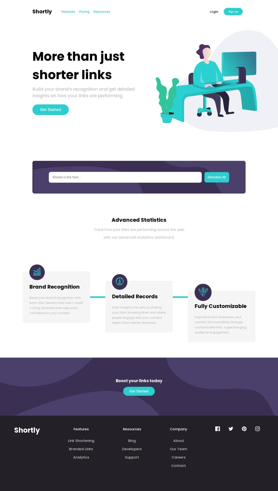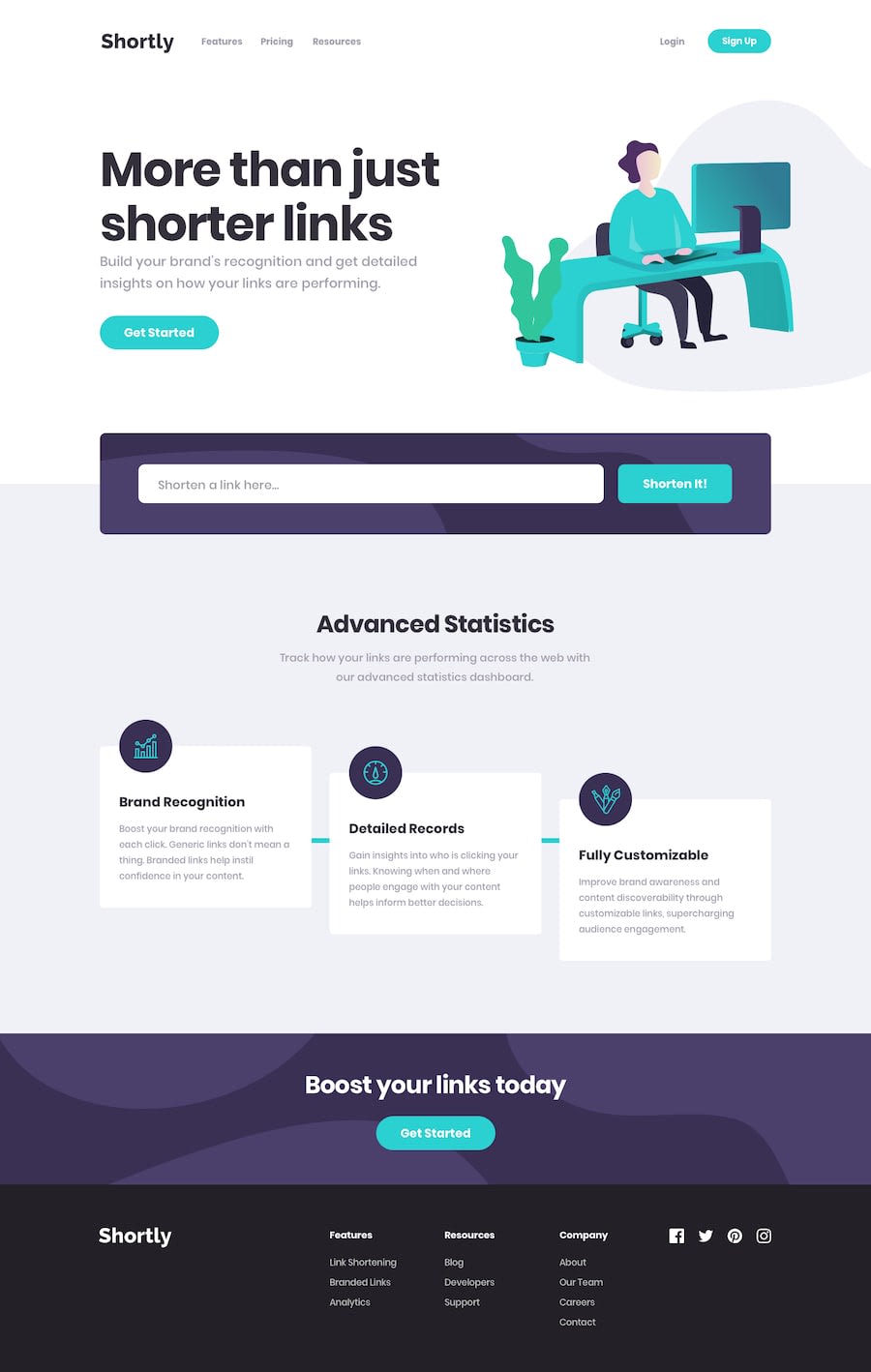
Design comparison
SolutionDesign
Solution retrospective
I found difficult was building the responsiveness of the website, this was all due to my CSS code being very unorganized. So, what I did was I added comments to every section, and I used the developer chrome inspection tab, where I was able to locate which specific classes I needed to target and make responsive based on requirements on hand.
What are some best practices in my JavaScript and HTML code? Is it readable as well?
All feedback is greatly appreciated :)
Community feedback
Please log in to post a comment
Log in with GitHubJoin our Discord community
Join thousands of Frontend Mentor community members taking the challenges, sharing resources, helping each other, and chatting about all things front-end!
Join our Discord
