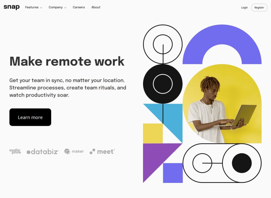


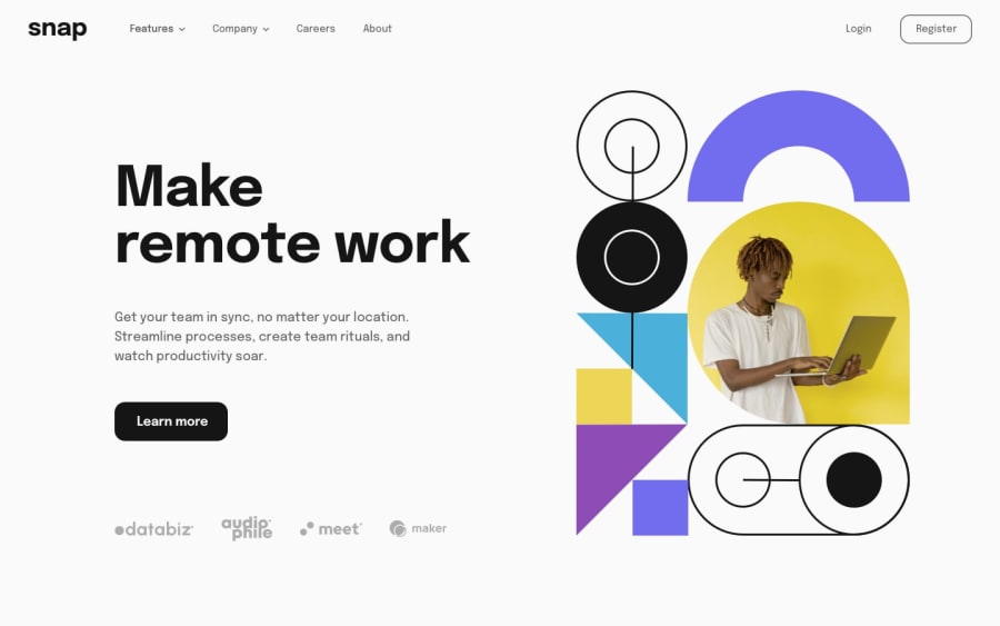
Design comparison
SolutionDesign
Solution retrospective
What are you most proud of, and what would you do differently next time?
Highlights:
- Designing the mobile navigation with smooth transition from the right.
- Styling the client logos to be responsive and consistent with design on mobile and desktop
- Using order css to handle positioning of hero image and the subsequent content in the intro section
What I need to improve
- Spacing and sizing in header.
Community feedback
Please log in to post a comment
Log in with GitHubJoin our Discord community
Join thousands of Frontend Mentor community members taking the challenges, sharing resources, helping each other, and chatting about all things front-end!
Join our Discord