Design comparison
SolutionDesign
Solution retrospective
What are you most proud of, and what would you do differently next time?
I liked working on this solution. I think I will redo this challenge use a framework. When rendering a country's detail on the country page, I found myself implementing dynamic rendering. This is shown below
          Border Countries:


          ${(function () {
            let innerHtml = ""

            for(let i = 0; i != country.borderCountries.length; ++i){
              innerHtml +=
              `

                  ${country.borderCountries[i]}

              `
            }

            return innerHtml
          })()}
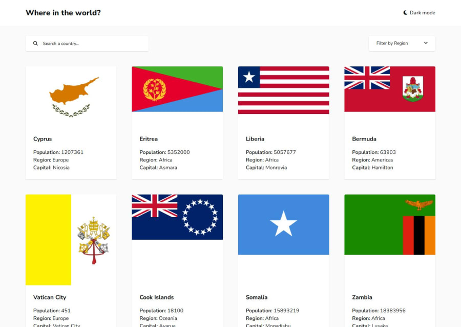
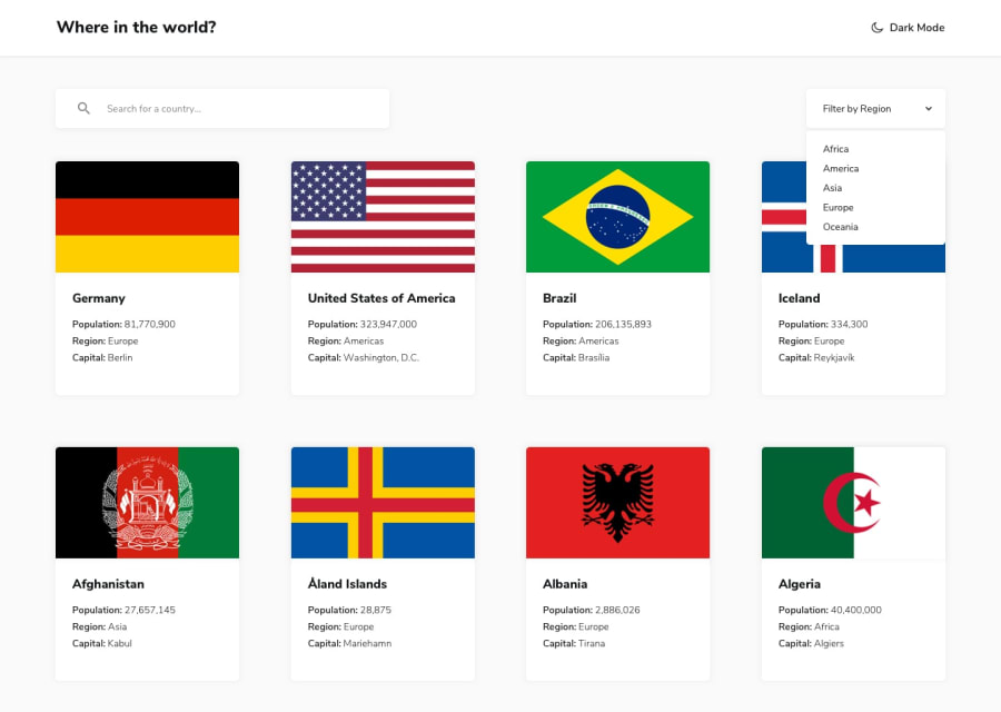
- I could not line up the country flags and country details on the countries page without distorting some of the flag images as shown in the design files. The reason for this is because the images of the flags have different aspect ratios. Forcing them to fill equal sized image containers would distort all of them except for those that have the same aspect ratio and size as that of the container. I solved this by allowing the larger images to decide the size of the grid cells on their rows. The other country cards with smaller images then fill the grid cell. I then applied flex column and justify between to the country details card.
I know this is not the best solution for this challenge so if you can spare some time, please point out some design mistakes I made and possible improvements.
Thank you
Community feedback
Please log in to post a comment
Log in with GitHubJoin our Discord community
Join thousands of Frontend Mentor community members taking the challenges, sharing resources, helping each other, and chatting about all things front-end!
Join our Discord
