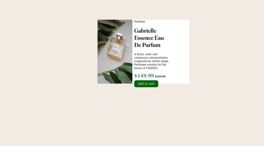
Design comparison
SolutionDesign
Community feedback
- @sarvothamgowdaPosted over 2 years ago
Hi Sai Kiran,
Good start.
- You can center the container by using flex in the body and its properties. Learning flex and grid would help you to solve most of the challenges. Instead of using <br> make use of the margin property to create space between elements.
body { min-height: 100vh; display: flex; justify-content: center; align-items: center; }- As a good practice use:
<html lang="en">
     <head>
            <meta chartset="UTF-8">
            <meta name="viewport" content="width=device-width, initial-scale=1.0">
     </head>
</html>
You can learn more about the attributes and tags here https://www.w3schools.com/
- The font and colors are not as per the design. So you really need to read the relevant style files provided as a part of this challenge.
Hope this helps!
Marked as helpful1
Please log in to post a comment
Log in with GitHubJoin our Discord community
Join thousands of Frontend Mentor community members taking the challenges, sharing resources, helping each other, and chatting about all things front-end!
Join our Discord
