Design comparison
Solution retrospective
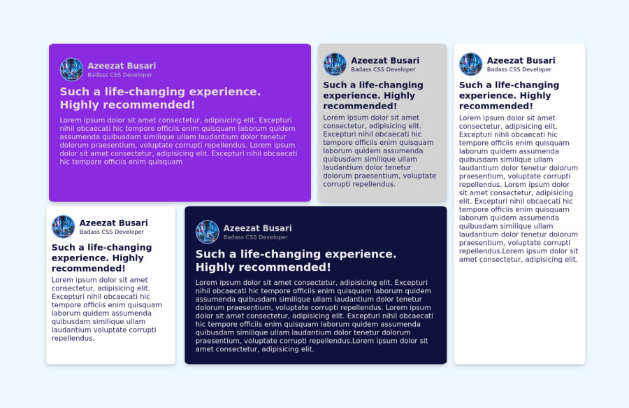
I promise to get back with something mobile responsive once I get it done. Kindly suggest improvements. I coded without the materials so don't expect it to look exactly like what is in the challenge. Thanks
Community feedback
- @MojtabaMosaviPosted almost 3 years ago
1- Consider spending some time reading about mobile first workflow since it makes it much easier to achieve responsiveness.
2- An article tag describes a self-contained and independet piece of content, a review fits nicely into that description and therefore you should use it instead of div.
3- I don't know why you substituted the original text but if you hadn't a blockqoute would the perfect semantic tag for them.
4- When using h1-h6 keep in mind that you need to maintain a heirarchy so it doesn't become confusing for users of assitive technologies.
Keep coding :=)
Marked as helpful0
Please log in to post a comment
Log in with GitHubJoin our Discord community
Join thousands of Frontend Mentor community members taking the challenges, sharing resources, helping each other, and chatting about all things front-end!
Join our Discord