Design comparison
Community feedback
- @Alucard2169Posted over 3 years ago
Hi there @FelipeFama Great job on this project 🎉🎉🎉
Here are a few things you can improve:-
-
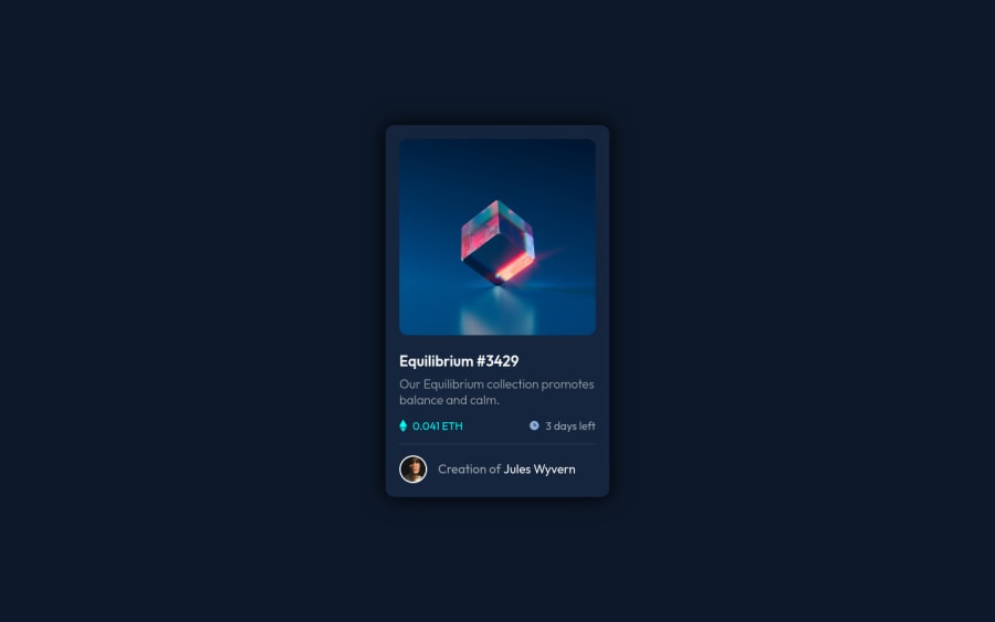
Your card is a bit too big in height, you can work on that.
-
That will solve the scrolling issue, if it doesn't just use
overflow:hiddenon the body, but make sure that your card is fully visible. -
To center your card you can use
display:flexon body -
Also keep in mind that you can't actually write your content directly inside the
<div>tag, div tag is use to divide our content into parts, you have to write your content inside tags like<p>,<h1>,<article>,<aside>which are made to store content.
Nice project, keep it up 😊😊😊
Marked as helpful1 -
- @FelipeFamaPosted over 3 years ago
Hi @Alucard2169, thank you very much for your feedback.
1
Please log in to post a comment
Log in with GitHubJoin our Discord community
Join thousands of Frontend Mentor community members taking the challenges, sharing resources, helping each other, and chatting about all things front-end!
Join our Discord
