Submitted 11 months ago
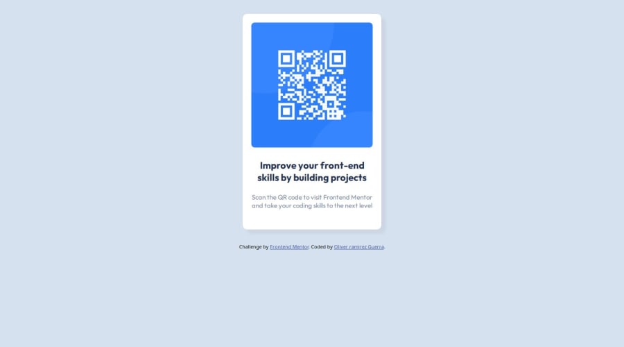
Web page created using mobile-first approach and HTML and CSS.
@Liv-er
Design comparison
SolutionDesign
Solution retrospective
What are you most proud of, and what would you do differently next time?
I am proud of my code because it is readable, and anyone could understand it. What I would do differently next time is to use JavaScript to make the page more dynamic.
What challenges did you encounter, and how did you overcome them?The challenges I faced creating this initial solution were that it was my first time using Figma and my first professional project where I was given the design and images to use, and I just had to create the page.
What specific areas of your project would you like help with?In terms of my code, I would like:
- Best practices
- Improved readability.
Community feedback
Please log in to post a comment
Log in with GitHubJoin our Discord community
Join thousands of Frontend Mentor community members taking the challenges, sharing resources, helping each other, and chatting about all things front-end!
Join our Discord
