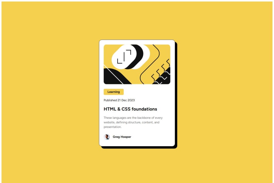
Design comparison
SolutionDesign
Solution retrospective
What are you most proud of, and what would you do differently next time?
I tried to keep in mind all the remarks from previous challenge and implement them here.
What challenges did you encounter, and how did you overcome them?It was difficult to make a proper shadow of the card. And for Hover i had to google a bit.
Community feedback
- @MikDra1Posted 3 months ago
Here are some things to review:
-
I see that you have margin of 8px on everything cause of not reseting it. I advise you to use THIS CSS reset next time.
-
I also highly encourage you to start using BEM methodology so that when you come to your project in 1 year you will still know what all of this classes mean.
Hope you found this comment helpful 💗
Good job and keep going 😁😊😉
0 -
Please log in to post a comment
Log in with GitHubJoin our Discord community
Join thousands of Frontend Mentor community members taking the challenges, sharing resources, helping each other, and chatting about all things front-end!
Join our Discord
