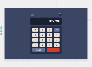
Design comparison
Community feedback
- @egstarPosted 11 months ago
Good job so far
** Here are some hints to make it better. **
CSS
- Keypads inner text needs to be margin top a lil bit
- Whole Calculator needs to be centered in the screen view
- use border-bottom instead of box shadow for the buttons shadow
- Text buttons font should be little smaller
and rest of works are charming.
JS
-
You need to display numbers with
,after 3 letters, you can achieve it usingeval()function -
Equal button isn't working correctly, you need to fix it so it should work correctly. as it clears the display on press.
-
Default screen should showing always
0not to be empty -
You must prevent multi
.dots as the number could be floats once, and replace the result with0.if the left hand of.is empty -
DELbutton must target the last digit of your current screen number, not to reset the whole number as theResetbutton does the reset function -
For the bounce level, you could use
localStorage()function to save the current theme so user can get the same Theme after refresh.
that's all what i got until now, but it was great work btw. Goodluck.
0
Please log in to post a comment
Log in with GitHubJoin our Discord community
Join thousands of Frontend Mentor community members taking the challenges, sharing resources, helping each other, and chatting about all things front-end!
Join our Discord
