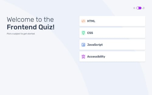
vuejs typescript tailwindcss css
Design comparison
Solution retrospective
when coding with the complex data structure, I found it is very difficult to remember the structure, then I use Typescript to help me.
manage theme colors is very difficult, without the help of daisyui lib.
Community feedback
- @gmagnenatPosted 3 months ago
Hi, congrats for completing this project !
I noticed a few things in your solutions that could improve the user experience. There are a couple of details missing from the design that have their importance in my opinion.
- The first focusable element is the theme switcher. When using a screen reader the theme isn't announced and we cannot guess what is the option to check. As by the design it's a toggle between light and dark you could use radio buttons for this. It will also improve the accessibility as the user can use the native keyboard behaviour for radio buttons. You'll need to add proper labels and aria-describedby to the inputs.
- Your media switch to desktop is at a quite large screen size. under 1440px wide it is the mobile view displayed. I would adjust that to something more natural at smaller breakpoint.
- On the question validation, if a wrong answer is selected on the design a small check indicators shows the correct answer.
- If not answer is selected you have a small layout shifts caused by the display of the error under the button. You can use a grid layout instead for your page so you don't have this little switch. You could also hide the error when an answer is selected.
That's just a few things I noticed when checking your solution. I hope you find something useful in this list to improve it. Let me know if you have any questions.
Happy coding !
0
Please log in to post a comment
Log in with GitHubJoin our Discord community
Join thousands of Frontend Mentor community members taking the challenges, sharing resources, helping each other, and chatting about all things front-end!
Join our Discord