Design comparison
SolutionDesign
Solution retrospective
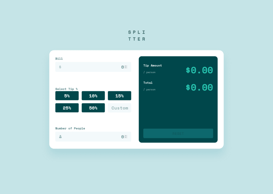
I'm aware that the site layout breaks a little when you input numbers that are too large - what improvements could I make to the "Totals" section of the UI to handle larger numbers?
Are there better ways I could've semantically written the HTML?
Can you find any bugs in my JS logic?
Community feedback
- @emestabilloPosted about 3 years ago
Hey James, it's me again 😄 Looks good! I think for the 'Totals' section, I might try flex instead of grid, so I can apply
flex-wrap: wrap. That way, large numbers would just go to the next line and still be pretty lol. Hope this helps!Marked as helpful1@james-work-accountPosted about 3 years ago@emestabillo interesting, I'll look into that. Thanks!
1
Please log in to post a comment
Log in with GitHubJoin our Discord community
Join thousands of Frontend Mentor community members taking the challenges, sharing resources, helping each other, and chatting about all things front-end!
Join our Discord
