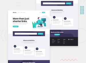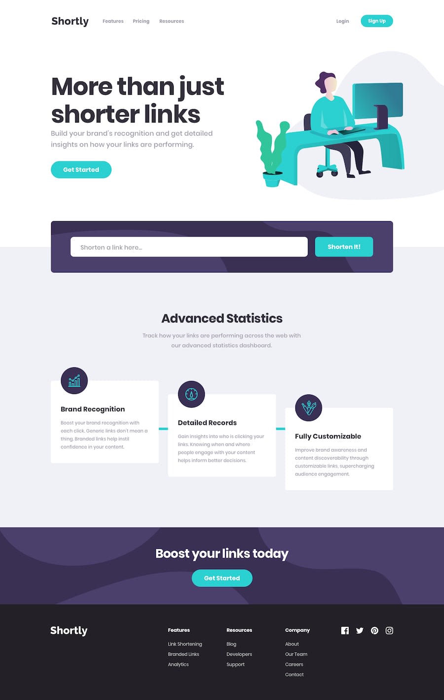
Design comparison
Solution retrospective
This is my first approach to Vue 3 and new features. My code needs some polish, because it's little messy right now, so I will eventually refactor it. For now I'm mostly interested in feedback regarding responsivness, html semantics and general UX, but any tips and opinions are welcome.
Community feedback
- @ApplePieGiraffePosted almost 4 years ago
Hey, Grzegorz Sterczewski! 👋
Nice work on this challenge! 👍 I like the way the mobile navigation slides in! 😉
I suggest,
- Adding a
max-widthto the main container or wrapper so that the content of the page doesn't look too stretched on extra-large screens. - Making sure the text inside the "Get Started" buttons don't disappear when they are hovered over.
Keep coding (and happy coding, too)! 😁
1@gsterczewskiPosted almost 4 years ago@ApplePieGiraffe Hey, thanks again for checking in! Problem with "Get Started" buttons is already solved I believe ( I made a mistake before and tested only on firefox, where problem did not occur) Regarding max-width on layout, I will tackle this soon. As always you were very helpful .
0 - Adding a
- @grace-snowPosted almost 4 years ago
Hey this looks nice! I like vue a lot and your components seem pretty clear.
I'm seeing a few minor visual issues on mobile but should be easy to fix
- hero img is spilling off the page to the right because of its width and margin. This is creating dead space to the right of that whole page. Either changes to the image css or to the body overflow-x should sort it.
- other thing is the social links seem oddly off center but I couldn't understand what their css was trying to do to find a cause.
Accessibility wise, you need to add clear focus states throughout, and make your menu button component use the button element. Those changes would make this work for keyboard users like me ☺
Well done and keep going
1@gsterczewskiPosted almost 4 years agoHey @grace-snow, thanks for your feedback, it is really helpful.
Regarding focus states, I improved it a little bit I think, so they should be more accessible now, but there is still a room for improvement for sure. A11y definetly should be my area of focus in next weeks.
The whole social links list is a mess and it needs to be replaced, I'm still thinking about some better solution to handle svg elements in Vue.
About hero img and dead space, I tinker with it earlier, so there should be some improvements by now, but I need to test it some more.
Thank you for taking the time to check out my solution. Best wishes.
0
Please log in to post a comment
Log in with GitHubJoin our Discord community
Join thousands of Frontend Mentor community members taking the challenges, sharing resources, helping each other, and chatting about all things front-end!
Join our Discord
