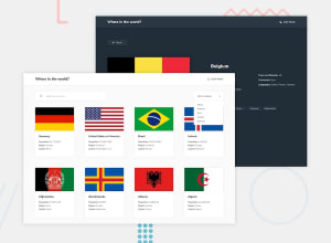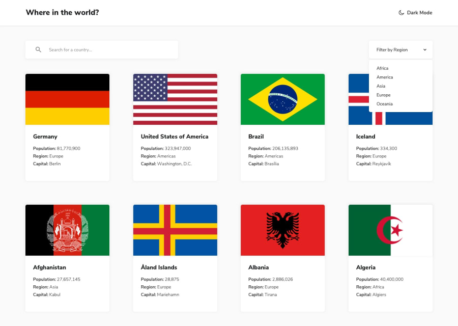
Design comparison
SolutionDesign
Solution retrospective
Had great fun working on this project. Took a long time and learnt a lot during the process.
Challenges included:
- Sending a second API request for the border countries after first API request had finished
- Dark mode theme switcher
- Search bar to automatically update content
- Dropdown filter CSS to match design
- Back button based on user history
- Loading animation before API request completes
Very happy with the way it turned out. If you got a few minutes then please check it out and let me know if you have any feedback.
I'll appreciate feedback on best practices for CSS, HTML, Vue.js
Community feedback
- @mattstuddertPosted about 5 years ago
Hey Daniel, I'm glad you enjoyed this challenge! You've done a really good job getting everything working nicely. Here are a few pointers after taking a look at your code:
- For the region filter, you're currently hardcoding each item. Another approach would be to have an array of the regions
['Africa', 'Americas', 'Asia', 'Europe', 'Oceania']and then iterate over it to generate the items. This would reduce your code quite a bit. - Also, I'd recommend breaking out your code into smaller components. This makes the code much more manageable and maintainable.
- For your CSS breakpoints, you're currently using
max-widthmedia queries. For a future project, I'd recommend having a go at usingmin-widthas it means mobile users load in fewer styles.
I hope these tips help. Let me know if you have any more questions! 🙂
0 - For the region filter, you're currently hardcoding each item. Another approach would be to have an array of the regions
Please log in to post a comment
Log in with GitHubJoin our Discord community
Join thousands of Frontend Mentor community members taking the challenges, sharing resources, helping each other, and chatting about all things front-end!
Join our Discord
